UrbanBlueprint: Redefining Google Maps for the Design Professional
A bespoke visual style transforming geospatial data into a powerful tool for architects and interior designers.
UrbanBlueprint: Redefining Google Maps for the Design Professional
A bespoke visual style transforming geospatial data into a powerful tool for architects and interior designers.
This style aims to declutter the visual noise of standard maps, highlighting essential urban fabric and architectural details with a sophisticated, professional aesthetic. It offers enhanced readability for complex urban environments, allowing designers to quickly grasp site conditions, adjacencies, and contextual elements crucial for their projects. UrbanBlueprint is designed to integrate seamlessly into design workflows, from initial conceptualization to detailed planning.
Who it's for: For architects, urban planners, and interior designers, UrbanBlueprint provides a meticulously crafted Google Maps style that prioritizes spatial context, aesthetic clarity, and design-centric information. It transforms the digital map into an indispensable tool for site analysis, conceptualization, and client presentations.
The Design Professional's Dilemma: Why Standard Maps Fall Short
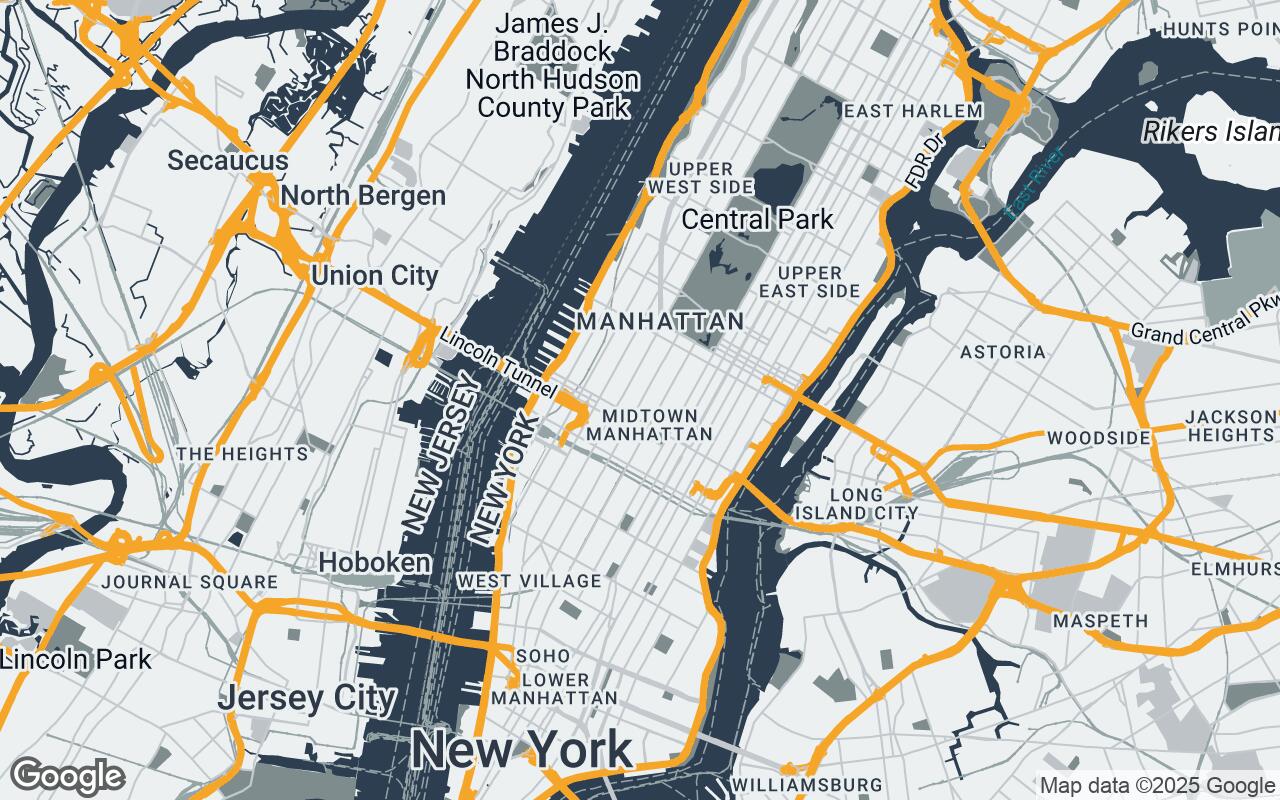
This section explains how the style improves clarity, reduces visual noise, and preserves hierarchy so roads, water, parks, and key POIs read at a glance.
Introducing UrbanBlueprint: A Vision for Spatial Clarity
This section explains how the style improves clarity, reduces visual noise, and preserves hierarchy so roads, water, parks, and key POIs read at a glance.
Key Design Principles: Precision, Context, and Aesthetic Harmony
- Clarity over Clutter: Prioritize essential information.
- Contextual Readability: Emphasize urban fabric and site relationships.
- Sophisticated Minimalism: A refined, understated visual language.
- Hierarchical Information: Clear visual distinction for different data types.
- Architectural Relevance: Highlight building forms and land use.
- Print-Ready Aesthetic: Optimized for high-quality export and presentation.
- Subtle Depth: Use of shadows and textures for spatial understanding.
Deconstructing the Palette: Colors that Speak to Design
- Primary: #2C3E50
- Secondary: #7F8C8D
- Accent: #F39C12
- Neutrals: #ECF0F1, #BDC3C7, #95A5A6, #34495E
Navigating the Urban Fabric: Enhanced Visibility for Critical Elements
This section explains how the style improves clarity, reduces visual noise, and preserves hierarchy so roads, water, parks, and key POIs read at a glance.
The Art of Labeling: Information Without Distraction
This section explains how the style improves clarity, reduces visual noise, and preserves hierarchy so roads, water, parks, and key POIs read at a glance.
Beyond Navigation: Applications in Site Analysis and Client Presentations
This section explains how the style improves clarity, reduces visual noise, and preserves hierarchy so roads, water, parks, and key POIs read at a glance.
Integrating UrbanBlueprint into Your Workflow
This section explains how the style improves clarity, reduces visual noise, and preserves hierarchy so roads, water, parks, and key POIs read at a glance.
Future Enhancements: What's Next for Design-Centric Mapping
This section explains how the style improves clarity, reduces visual noise, and preserves hierarchy so roads, water, parks, and key POIs read at a glance.
Empowering Creativity: How UrbanBlueprint Elevates Design Thinking
This section explains how the style improves clarity, reduces visual noise, and preserves hierarchy so roads, water, parks, and key POIs read at a glance.