Stratum View: Redefining Google Maps for Architectural Design
A Professional Cartographic Style for Contextual Analysis and Creative Inspiration
Stratum View: Redefining Google Maps for Architectural Design
A Professional Cartographic Style for Contextual Analysis and Creative Inspiration
The Architect's Canvas: Why Standard Maps Fall Short
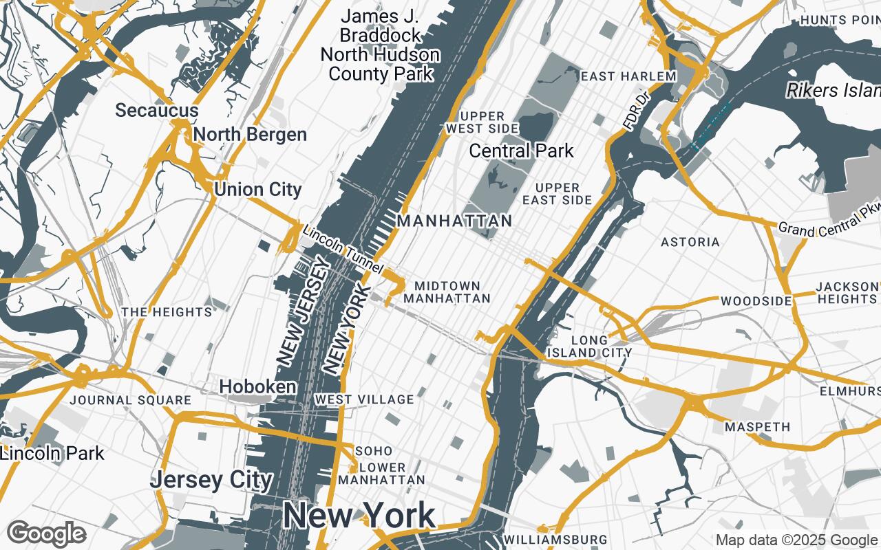
For architects, interior designers, and urban planners, a map is far more than a tool for navigation; it's a foundational canvas. It's where the urban fabric reveals its secrets, where site potential is first glimpsed, and where design narratives begin to unfold. Yet, for too long, professionals have grappled with generic mapping solutions that fall short of their specific needs. Standard Google Maps, while incredibly powerful for general use, often present a visual cacophony of distracting points of interest, vibrant commercial branding, and an overwhelming palette that obscures the very elements crucial for design analysis.
This visual noise makes it challenging to discern critical information like building massing, street hierarchies, and the subtle interplay of green spaces. The default aesthetic is rarely suitable for client presentations or integration into design documents, often requiring extensive post-processing to achieve a professional, clean look. Architects need a map that speaks their language – a map that prioritizes clarity, context, and a refined aesthetic, allowing them to focus on the inherent design qualities of a site rather than battling visual clutter.
Introducing Stratum View: A Design-Centric Approach
We are thrilled to introduce Stratum View, a revolutionary Google Maps style meticulously crafted for the discerning eye of the design professional. Stratum View transforms Google Maps into an indispensable tool for the architectural and interior design community, offering a sophisticated canvas for contextual analysis, site planning, and material inspiration. It caters to professionals who value clarity, aesthetic precision, and the ability to visualize urban fabric as a design element.
Stratum View's core mission is to strip away visual noise, highlighting essential urban elements like building massing, streetscapes, and green spaces with a refined aesthetic. The goal is to provide a clean, contextually rich, and print-friendly base layer that seamlessly integrates into architectural workflows, aiding in site analysis, client presentations, and conceptual design. It's not just a map; it's a design instrument, designed to elevate your understanding of place and inspire your creative process.
Core Principles: Clarity, Context, and Print-Readiness
Stratum View is built upon a foundation of carefully considered design principles, ensuring every pixel serves a purpose in enhancing your design workflow:
- Clarity over Clutter: We prioritize essential architectural and urban planning data, removing extraneous details that distract from site analysis. This means fewer distracting labels and a focus on the fundamental elements of the built environment.
- Materiality & Texture: Through subtle color variations and shading, Stratum View suggests the inherent qualities of urban materials, from the solidity of buildings to the permeability of green spaces, offering a tactile sense of the environment.
- Contextual Harmony: The urban fabric is presented as an integrated, readable composition. Elements flow together harmoniously, allowing for a holistic understanding of the site within its broader surroundings.
- Print-Friendly: Optimized for legibility and aesthetic appeal in printed formats, Stratum View ensures that your site plans and presentation graphics maintain their professional integrity whether viewed on screen or on paper.
- Hierarchical Information: Elements are clearly differentiated based on their design relevance, guiding your eye to critical features without overwhelming it.
- Subtle Accentuation: Color is used sparingly and strategically to highlight key features or areas of interest, ensuring emphasis without distraction.
- Scalable Detail: Stratum View maintains visual integrity and clarity across various zoom levels, from a broad urban overview to a detailed site plan, ensuring consistent utility.
A Palette for Precision: Understanding Stratum View's Color Language
The aesthetic power of Stratum View lies in its carefully curated color palette, designed to evoke a sense of professionalism and clarity while subtly communicating information:
- Neutrals (
#F8F8F8,#E0E0E0,#B0B0B0,#6B6B6B): These form the backbone of the map, providing a sophisticated, understated foundation. They define roads, urban blocks, and general terrain, allowing other elements to emerge with subtle distinction. The lighter tones create a clean background, while darker grays provide depth and delineate major infrastructure. - Primary (
#4A606A): A deep, calming blue-gray, this color is primarily used for water bodies, giving them a serene and reflective quality that contrasts gently with the urban fabric without being overly vibrant. - Secondary (
#8D9B9E): A lighter, more muted blue-gray, this hue is reserved for green spaces and parks. It signifies natural elements with a soft, organic feel, ensuring they are distinct yet harmonious within the overall composition. - Accent (
#D79922): A warm, inviting amber, this is the sole accent color. It's deployed judiciously to highlight specific points of interest, project boundaries, or critical annotations, drawing the eye precisely where needed without disrupting the map's overall tranquility.
This palette ensures that Stratum View is not only visually appealing but also highly functional, allowing for intuitive interpretation of the urban landscape.
Visualizing Urban Fabric: Buildings, Roads, and Green Spaces
Stratum View reinterprets the fundamental elements of a map to serve design needs:
- Buildings: Rendered with clean, defined massing and subtle shading, buildings are presented as solid forms, allowing for immediate understanding of urban density and volumetric relationships. Distracting labels are minimized, focusing on the architectural presence.
- Roads: Street networks are depicted with clear, hierarchical lines, using varying shades of neutral gray to differentiate between major thoroughfares and local streets. This clarity aids in understanding traffic flow and pedestrian pathways.
- Green Spaces: Parks, gardens, and natural areas are rendered in the soft secondary blue-gray, providing a distinct yet harmonious contrast to the built environment. This allows for easy identification of open spaces and their integration into the urban plan.
- Water Bodies: Lakes, rivers, and coastlines are presented in the primary blue-gray, conveying a sense of calm and depth, essential for understanding hydrological context.
- Points of Interest (POIs): Generic POIs are largely suppressed. When present, they are stylized minimally, ensuring they only provide essential context without visual clutter.
Beyond Navigation: Leveraging Stratum View for Site Analysis
Stratum View transcends basic wayfinding, becoming an invaluable asset for in-depth site analysis:
- Contextual Massing Studies: Quickly grasp the scale and form of surrounding buildings, informing your design's response to its immediate environment.
- Sun Path and Shadow Analysis: The clear depiction of building forms and terrain allows for intuitive understanding of solar exposure and shadow casting, crucial for sustainable design.
- Pedestrian and Vehicular Flow: Analyze street hierarchies and public spaces to understand movement patterns and inform site access strategies.
- Material Inspiration: The subtle suggestion of material qualities in the map's aesthetic can spark ideas for your project's own material palette, drawing inspiration from the existing urban fabric.
- Client Presentations: Present your site analysis and conceptual designs with a professional, sophisticated base map that enhances credibility and clarity.
Integrating with Workflow: From Concept to Presentation
Stratum View is designed for seamless integration into your existing architectural workflow. Whether you're conducting initial site reconnaissance, developing conceptual designs, or preparing final client presentations, Stratum View provides a consistent, high-quality base layer. Its print-friendly nature means you can confidently export high-resolution images for reports, boards, and digital presentations, knowing the aesthetic integrity will be maintained.
The Future of Design Cartography: Expanding Possibilities
Stratum View represents a significant step forward in design cartography, but it's just the beginning. We envision future enhancements that could include customizable overlays for specific data (e.g., zoning, historical layers), integration with 3D modeling software, and even more refined material suggestions. The goal is to continuously evolve Stratum View as the definitive cartographic tool for the design community, pushing the boundaries of how maps inform and inspire architectural creation.
Implementing Stratum View: A Guide to Styled Maps
Adopting Stratum View for your projects is straightforward. This professional style can be easily applied to your Google Maps implementations through the Google Cloud Console. Designers can leverage the Maps JavaScript API, Static Maps API, or other Google Maps Platform products to integrate Stratum View into their web applications, design tools, or presentation materials. Detailed documentation and styling guides will be available to help you quickly implement and customize Stratum View to perfectly suit your project's unique requirements, ensuring a smooth transition to a more refined and architecturally intelligent mapping experience.