SpatialSense: A New Cartographic Standard for Architectural Design
Elevating Site Analysis and Contextual Understanding for Architects and Interior Designers with Precision Mapping
SpatialSense: A New Cartographic Standard for Architectural Design
Elevating Site Analysis and Contextual Understanding for Architects and Interior Designers with Precision Mapping
Introduction: Unveiling SpatialSense – The Architect's Map
For too long, architects, interior designers, and urban planners have navigated the complexities of site analysis and contextual understanding with generic mapping tools. While functional for general navigation, these maps often overwhelm with irrelevant data, lack the nuanced detail crucial for design, and fail to present information in a way that truly speaks to the design professional's needs.
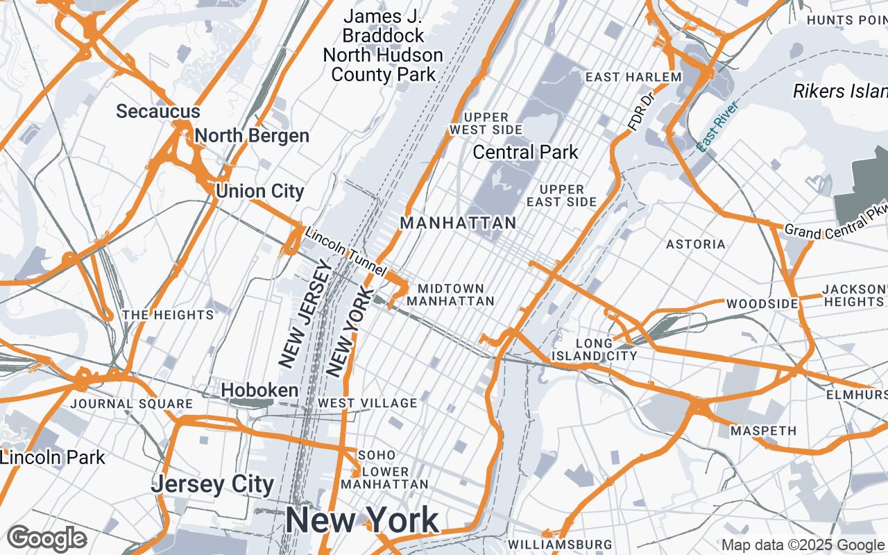
Enter SpatialSense, a groundbreaking Google Maps visual style meticulously crafted for the architecture and interior design community. SpatialSense is not just a map; it's a sophisticated lens designed to enhance your perception of space, context, and materiality. It prioritizes clarity and precision, offering an uncluttered, context-rich view of urban and interior environments. By emphasizing topographical features, building footprints, and subtle material distinctions, SpatialSense empowers designers to conduct thorough site analysis and visualize project contexts with unprecedented accuracy, supporting informed decision-making throughout the entire design process.
The Imperative for Specialized Cartography in Design
Architectural and interior design projects are deeply rooted in their environment. Understanding a site's topography, surrounding structures, pedestrian flows, and even the subtle textures of the urban fabric is paramount. Standard mapping solutions, however, are typically optimized for navigation, not for design. They often obscure critical information with vibrant, distracting colors, irrelevant points of interest, and a lack of emphasis on the physical attributes that shape a design's response to its setting.
Designers require a cartographic tool that:
- Filters out noise, highlighting only essential spatial data.
- Provides a clear hierarchy of information, prioritizing elements like building massing, terrain, and infrastructure.
- Offers visual cues for material and texture, even at a macro scale.
- Maintains precision and scale critical for accurate measurements and planning.
SpatialSense addresses these imperatives head-on, transforming a mere map into an indispensable design companion.
Core Design Principles: Precision, Clarity, and Context
SpatialSense is built upon a foundation of carefully considered design principles, ensuring every visual element serves a purpose in the design workflow:
Clarity Over Clutter
We believe less is more when it comes to critical analysis. SpatialSense minimizes distractions, stripping away superfluous labels and overly bright icons. The focus shifts entirely to the physical environment, allowing designers to quickly discern key spatial relationships without visual interference.
Hierarchical Information
Not all data is equally important. SpatialSense intelligently prioritizes relevant features for architectural analysis. Building footprints and topographical lines are prominent, while less critical elements recede into the background, ensuring that the most vital information is always front and center.
Materiality & Texture
Through subtle color and texture variations, SpatialSense suggests material properties. This allows designers to intuitively understand the composition of surrounding areas—identifying parks, water bodies, paved surfaces, and building types—even before detailed site visits, aiding in material consideration and contextual integration.
Precision & Scale
Accuracy is non-negotiable in design. SpatialSense maintains accurate representation critical for design measurements, ensuring that the visual data aligns perfectly with the precise demands of architectural planning and detailing.
Sophisticated Palette
Our chosen palette is a muted, professional color scheme that complements existing design visuals rather than competing with them. It's designed to be easy on the eyes during long analysis sessions and to enhance the legibility of your own design overlays.
Legible Typography
All labels, though minimal, are rendered with utmost clarity. Typography is carefully selected and sized to ensure readability at varying zoom levels, providing necessary geographical context without overwhelming the visual field.
Contextual Awareness
SpatialSense provides clear delineation of public, private, and transitional spaces. This understanding of spatial boundaries and relationships is fundamental for designing structures that interact harmoniously with their surroundings.
Deconstructing the Palette: Color Theory for Spatial Understanding
The visual language of SpatialSense is defined by its sophisticated and purposeful color palette. Far from arbitrary, each hue is selected to enhance clarity and contextual understanding:
- Primary (#E0E6EE) & Secondary (#B0BACC): These cool, muted tones form the bedrock of the map, providing a calm and unobtrusive background for most geographical features. They ensure that the base map elements are present but never distracting, allowing your design to take prominence.
- Neutrals (#F8F8F8, #C8D0DA, #7F8C8D, #34495E, #1F2E3A): A range of grays and desaturated blues define roads, water bodies, and subtle elevation changes. The lighter neutrals provide clean backgrounds for land, while darker shades delineate infrastructure and deeper water, creating a sense of depth and hierarchy without relying on bright, artificial colors.
- Accent (#E67E22): A strategic splash of warm orange serves as the sole accent color. This vibrant yet professional hue is reserved for highlighting specific points of interest, user-defined annotations, or critical boundaries that require immediate attention. It's a precise tool for drawing the eye, ensuring that key data stands out without overwhelming the overall composition.
This carefully curated palette promotes focus on spatial relationships and contextual nuances, making SpatialSense an ideal visual companion for any design professional.
Transforming Site Analysis: Leveraging Enhanced Building and Terrain Data
SpatialSense fundamentally redefines how architects approach site analysis. Beyond simple street layouts, it provides enhanced data visualization that directly impacts design decisions:
- Detailed Building Footprints: Buildings are rendered with clear, distinct footprints, allowing for immediate understanding of massing, density, and urban grain. This clarity supports accurate shadow studies, view corridor assessments, and an intuitive grasp of the built environment's scale.
- Precise Topographical Features: Contour lines and subtle elevation shading bring the terrain to life. Understanding the natural undulations of a site is crucial for drainage strategies, foundation design, and integrating a structure seamlessly into its landscape. SpatialSense makes these features immediately legible, aiding in environmental response and sustainable design.
This rich, precise data layer enables designers to conduct more thorough analyses, from sun path and wind studies to pedestrian flow and material sourcing, all within a visually coherent and professional framework.
Applications in Interior Design: Understanding Urban Fabric and Views
While often focused on the inside, interior design is profoundly influenced by the exterior. SpatialSense offers invaluable insights for interior designers by providing a detailed context of the urban fabric and potential views:
- Urban Fabric Integration: Understanding the surrounding building types, street patterns, and public spaces helps interior designers inform material choices, spatial layouts, and the overall ambiance of internal spaces that connect to the outside world.
- Viewshed Analysis: For projects with exterior windows, SpatialSense helps visualize potential views—whether it's a bustling street, a tranquil park, or an imposing neighboring building. This allows for strategic placement of functions, window treatments, and design elements that optimize or mitigate external influences.
- Light and Privacy Considerations: By clearly showing adjacent structures and their orientations, interior designers can better plan for natural light penetration and ensure privacy, designing spaces that are both aesthetically pleasing and functionally comfortable.
Streamlining Workflow: Integration with Design Software and Presentation
SpatialSense is designed to be a seamless addition to your existing design workflow. Its clean, professional aesthetic makes it ideal for:
- Direct Integration: As a Google Maps style, SpatialSense can be easily configured and applied, providing a consistent, high-quality base map for your projects. Its visual clarity ensures that when exported or screen-captured, the map data remains crisp and informative.
- Enhanced Client Presentations: Gone are the days of cluttered, confusing maps in client presentations. SpatialSense provides a sophisticated, easy-to-understand visual context that elevates your proposals. Its professional appearance reinforces your attention to detail and commitment to comprehensive design.
- Collaborative Clarity: When sharing project contexts with engineers, landscape architects, or urban planners, SpatialSense ensures everyone is literally on the same page, with a shared understanding of the site's critical features.
Implementing SpatialSense: A Guide to Google Styled Maps Configuration
Adopting SpatialSense into your workflow is straightforward. As a custom style layer, it can be easily implemented through the Google Maps Platform's styling options. Developers and designers can configure SpatialSense by applying the specific JSON style array to their map instances, ensuring consistent application across all projects. Detailed instructions and configuration guides are readily available through Google Maps Platform documentation, allowing for quick and efficient integration into your existing applications or custom map visualizations.
The Future of Design Mapping: Evolution and Community Contributions
SpatialSense represents a significant leap forward in cartographic tools for design professionals, but its journey is just beginning. We envision a future where design mapping is increasingly intelligent, responsive, and integrated into every stage of the creative process. We are committed to evolving SpatialSense, incorporating feedback from the architectural and design community to continuously refine its features, enhance its utility, and push the boundaries of what a design-centric map can achieve.
Join us in embracing this new standard. With SpatialSense, your maps will no longer just show you where you are; they will show you where your design can truly thrive.