SpatialCanvas: A Google Maps Style for Architectural Precision
Elevating Urban Cartography for Designers, Planners, and Visionaries
SpatialCanvas: A Google Maps Style for Architectural Precision
Elevating Urban Cartography for Designers, Planners, and Visionaries
In the intricate world of architecture, urban planning, and interior design, context is paramount. Every structure, every public space, every interior layout is a response to its surroundings. Yet, for too long, the foundational tool for understanding this context—the humble map—has fallen short of the precision and aesthetic demands of the design professional. Standard consumer-grade maps, while excellent for navigation, often present a cacophony of visual information, obscuring the very details critical for design analysis.
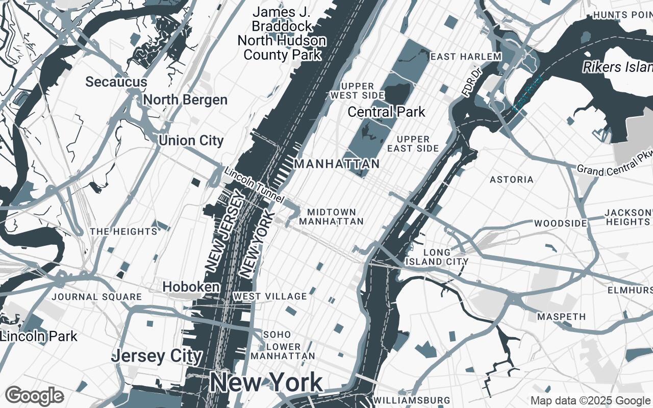
Enter SpatialCanvas, a revolutionary Google Maps style meticulously crafted for architects, urban planners, and interior designers. SpatialCanvas isn't just a map; it's a sophisticated aesthetic, prioritizing clarity, hierarchy, and a professional, muted color palette. It strips away unnecessary visual noise, highlighting structural elements, urban fabric, and key contextual information essential for design and planning. The aim is simple: to provide an analytical backdrop for detailed spatial work, transforming how designers interact with their project environments.
The Designer's Perspective: Why Standard Maps Fall Short
For the discerning eye of a designer, a typical Google Map can be overwhelming. Bright, often clashing colors, an abundance of Points of Interest (POIs), and a focus on real-time traffic or tourist information create a visual overload. This clutter forces designers to mentally filter out irrelevant data, a cognitive burden that detracts from the core task of spatial analysis and creative problem-solving.
Architects need to discern building footprints, property lines, topographical changes, and the subtle nuances of urban infrastructure. Urban planners require a clear understanding of land use, public spaces, and transportation networks without the distraction of commercial advertisements. Interior designers, while working within a building, still benefit immensely from understanding external views, sun paths, and the immediate neighborhood context. Standard maps, designed for general navigation, simply lack the precision, the aesthetic alignment, and the analytical focus required for professional design work.
Core Principles: Clarity, Hierarchy, and Professional Aesthetics
SpatialCanvas is built upon a foundation of carefully considered design principles, ensuring it serves as an indispensable tool for the design community:
- Clarity over Decoration: Every element on SpatialCanvas serves a purpose. Unnecessary embellishments, vibrant icons, and distracting labels are removed, allowing essential information to stand out without competition.
- Hierarchical Information Presentation: Critical data, such as major roads and significant building footprints, are subtly emphasized, while less crucial details recede into the background, guiding the eye without dictating focus.
- Subtle and Professional Color Harmony: A carefully curated palette ensures visual calm and sophistication, providing an ideal canvas for overlaying design proposals.
- Focus on Structural and Spatial Context: The style prioritizes the built environment—buildings, roads, water bodies, and topography—as the primary layers of information.
- Minimalist Aesthetic for Reduced Cognitive Load: By reducing visual complexity, SpatialCanvas helps designers maintain focus, fostering deeper analysis and more efficient decision-making.
- Precision in Line Work and Geometry: Crisp, accurate lines and clearly defined polygons are paramount, ensuring that the base map is reliable for measurements and detailed overlays.
- Adaptable for Overlaying Design Data: SpatialCanvas is designed to be a foundational layer, perfectly suited for integrating with and complementing a designer's own project-specific data.
Unpacking the Palette: Muted Tones for Focused Analysis
The visual identity of SpatialCanvas is defined by its sophisticated, muted color palette, chosen specifically to support analytical work rather than compete with it. This palette ensures a professional and calm aesthetic, allowing design interventions to truly pop:
- Primary (
#37474F) and Secondary (#607D8B): These deep, professional blues and grays are reserved for key structural elements like major roads, significant building outlines, and prominent water bodies. They provide a strong, yet understated, foundation. - Accent (
#78909C): A slightly lighter, more inviting blue-gray, this color is used sparingly to highlight specific features or points of interest that might be particularly relevant to a design project, drawing attention without being jarring. - Neutrals (
#F8F8F8,#E0E0E0,#C7C7C7,#A6A6A6): A range of soft grays and off-whites form the backbone of the map, defining background areas, land use, and less critical features. These neutrals create depth and separation, ensuring that the map feels layered and informative without ever becoming busy.
This harmonious blend creates an environment where the map serves as a supportive analytical tool, not a distracting visual spectacle.
Strategic Visibility: What to See and What to Hide
One of SpatialCanvas's most powerful features is its intelligent filtering of map elements. We've meticulously decided what to prioritize and what to de-emphasize or remove entirely. The focus is always on providing a rich, yet uncluttered, contextual layer:
- Prioritized: Building footprints, property lines, precise road networks, topographical contours, public parks, and key infrastructure are brought to the forefront. These are the elements that directly influence design decisions.
- De-emphasized or Removed: Excessive business labels, tourist attractions, overly bright transit lines (unless specifically relevant to a project's scope), and non-essential street furniture are either toned down or completely absent. The goal is to provide a