Spatial Canvas: Redefining Urban Cartography for Design Professionals
A Google Maps Visual Style Engineered for Architects, Interior Designers, and Urban Planners.
Spatial Canvas: Redefining Urban Cartography for Design Professionals
A Google Maps Visual Style Engineered for Architects, Interior Designers, and Urban Planners.
For too long, design professionals have wrestled with mapping tools that weren't built for them. Generic maps, while excellent for navigation, often present a cacophony of visual information – bright colors, distracting points of interest, and an overemphasis on natural terrain – that actively hinders the precise, context-rich analysis required in architecture, urban planning, and interior design. The need for a map that speaks the language of design has never been clearer.
The Need for Design-Centric Maps: Why Generic Maps Fall Short for Professionals
Imagine trying to present a meticulously crafted architectural proposal against a backdrop of vibrant tourist attractions and a rainbow of road classifications. The visual noise is not just distracting; it actively competes with your design, diluting its impact and obscuring critical spatial relationships. Standard mapping services, by their very nature, prioritize broad utility over specialized precision. For architects, urban planners, and interior designers, this means:
- Visual Clutter: Overly saturated colors, an abundance of labels, and non-essential features obscure the built environment.
- Lack of Hierarchy: Key elements like property lines, building footprints, and infrastructure often blend into the background.
- Inadequate Context: While showing the world, they often fail to emphasize the specific urban fabric and site conditions crucial for design.
- Unprofessional Aesthetics: The vibrant, consumer-oriented look is rarely suitable for high-stakes client presentations or design reviews.
These limitations force professionals to spend valuable time manually editing, simplifying, or even redrawing map data – a process that is inefficient and prone to error.
Introducing Spatial Canvas: A "Sand-Table" Aesthetic for Precision
Enter Spatial Canvas, a revolutionary Google Maps visual style meticulously engineered to meet the exacting demands of the design community. Designed for architects, urban planners, and interior designers, this style provides a clean, detailed, and context-rich base map, facilitating site analysis, design conceptualization, and professional presentations.
Spatial Canvas transforms Google Maps into a sophisticated tool for design professionals. It prioritizes clarity and precision, offering a muted, "sand-table" aesthetic that highlights built environments and critical infrastructure without visual clutter. This style is ideal for overlaying design proposals, understanding urban fabric, and communicating spatial relationships with elegance and accuracy.
Key Design Principles: Clarity, Hierarchy, and Contextual Relevance
Every aspect of Spatial Canvas has been thoughtfully crafted around a core set of design principles, ensuring it serves as an intuitive and powerful partner in your workflow:
- Clarity through Subtlety: Muted colors and reduced saturation bring the focus to your design overlays, allowing your work to stand out.
- Hierarchical Information: Clear visual distinction between primary, secondary, and tertiary map elements ensures you can quickly grasp the most important data.
- Contextual Relevance: We emphasize built forms, infrastructure, and property lines while gracefully de-emphasizing natural terrain, providing the most relevant urban context.
- Presentation-Ready Aesthetics: A clean, professional look that is instantly suitable for client presentations and critical design reviews.
- Scalable Detail: Maintain legibility and information hierarchy across various zoom levels, from broad urban planning to detailed site analysis.
- Minimalist Labeling: Only essential labels are displayed, rendered in a clean, sans-serif typography that enhances readability without distraction.
- Architectural Grid Integration: Subtle grid lines or property boundary emphasis are integrated where relevant, providing immediate spatial reference.
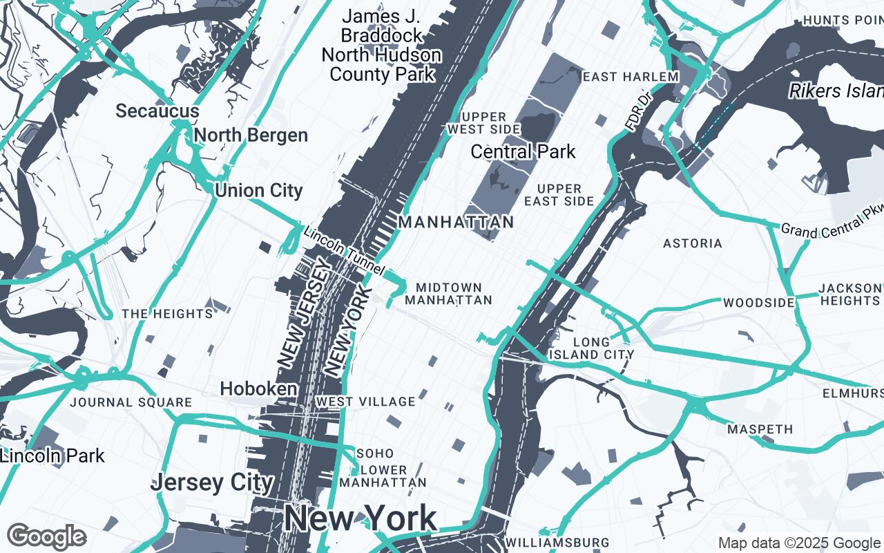
Palette Deep Dive: The Power of Muted Tones and Strategic Accents
The visual language of Spatial Canvas is defined by a sophisticated and deliberate color palette, designed to support, not overshadow, your design work. The core of its "sand-table" aesthetic lies in its intelligent use of color:
- Neutrals (
#F7FAFC,#EDF2F7,#E2E8F0,#CBD5E0,#A0AEC0): These form the bedrock of the style, providing a calm, unobtrusive background. They create a sense of depth and texture without drawing undue attention, allowing built forms and key features to emerge naturally. - Primary (
#4A5568): Used for primary roads, significant building outlines, and essential infrastructure, this color provides clear definition without harshness. - Secondary (
#718096): Applied to secondary roads, smaller building details, and less critical infrastructure, offering a subtle distinction that maintains visual hierarchy. - Accent (
#38B2AC): A carefully chosen, vibrant teal that serves as a strategic highlight. This accent color is reserved for drawing attention to specific design elements, proposed interventions, or critical points of interest within your overlays, ensuring they pop against the muted base.
This palette embodies the principle of