Spatial Blueprint: Redefining Google Maps for Architectural Design
A Professional Visual Style for Architects and Interior Designers to Enhance Site Analysis and Conceptual Planning
Spatial Blueprint: Redefining Google Maps for Architectural Design
A Professional Visual Style for Architects and Interior Designers to Enhance Site Analysis and Conceptual Planning
In the intricate world of architectural and interior design, every detail matters. From the grand vision of a skyscraper to the subtle nuances of an interior space, design professionals meticulously craft environments that are both functional and aesthetically compelling. Yet, a fundamental tool in their arsenal—the humble map—has often fallen short of their specialized needs. Standard mapping services, while excellent for navigation, present a visual cacophony of information, obscuring the critical data points essential for site analysis and conceptual planning.
Enter Spatial Blueprint, a revolutionary Google Maps visual style meticulously crafted for the discerning architect, interior designer, and urban planner. Spatial Blueprint transforms Google Maps from a mere navigational aid into a powerful, precise, and context-rich platform, empowering designers to make more informed decisions and visualize their projects with unprecedented clarity.
The Need for Specialized Mapping in Design
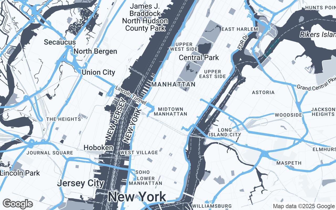
For design professionals, a map is far more than a guide; it's a canvas, a data repository, and a foundational element for every project. Traditional maps, however, are often cluttered with tourist attractions, traffic indicators, and an overwhelming array of points of interest that distract from the core elements designers need: topography, existing structures, public spaces, and the subtle interplay of the built and natural environment. This visual noise forces designers to mentally filter out irrelevant information, a time-consuming and often imprecise process.
Spatial Blueprint addresses this critical gap, offering a minimalist yet information-rich view that prioritizes the elements vital to spatial planning. It's about seeing the forest and the trees, but with a focus that empowers design, not just direction.
Understanding the Design Professional's Workflow
Our persona is the discerning architect or interior designer who requires a clean, precise, and context-rich map view to inform their spatial planning and design decisions. They value clarity over clutter and accurate representation of built and natural environments. Their workflow often involves:
- Site Analysis: Understanding sun paths, wind directions, access points, surrounding building heights, and material palettes of the neighborhood.
- Contextual Integration: Ensuring new designs harmonize with the existing urban fabric or natural landscape.
- Conceptual Planning: Sketching initial ideas, massing studies, and exploring spatial relationships directly on a reliable base map.
Spatial Blueprint is engineered to seamlessly integrate into these critical stages, providing an intuitive platform that enhances, rather than hinders, the creative process.
Core Principles of Spatial Blueprint: Clarity, Context, Precision
At the heart of Spatial Blueprint lies a set of carefully considered design principles, each aimed at optimizing the map for professional use:
- Clarity over Clutter: We minimize unnecessary visual elements, stripping away distractions to reveal the essential.
- Contextual Richness: Emphasis is placed on surrounding structures, topography, and public spaces, providing a holistic understanding of the site.
- Precision in Representation: Crisp lines and accurate geometry ensure that every feature is depicted with professional-grade exactitude.
- Subtle Hierarchy: Elements are differentiated through thoughtful use of color and line weight, guiding the eye without overwhelming it.
- Legible Typography: All labels are designed for maximum readability, ensuring quick and accurate information retrieval.
- Aesthetic Neutrality: The style provides a professional, understated visual foundation that complements any design concept.
- Scalable Detail: Clarity is maintained across various zoom levels, from broad urban planning to detailed site layouts.
These principles coalesce to create a map that is not just functional, but truly intelligent, anticipating the needs of the design professional.
The Palette of Purpose: Color Psychology in Technical Mapping
The visual language of Spatial Blueprint is defined by a sophisticated and purposeful color palette, carefully selected to enhance readability and reduce visual fatigue:
- Accent (#63B3ED): A vibrant yet professional blue, reserved for highlighting key features, points of interest relevant to design, or user-defined annotations. It draws attention without being jarring.
- Neutrals (#F7FAFC, #EDF2F7, #CBD5E0, #718096, #2D3748): A gradient of grays and off-whites forms the backbone of the map. These provide a clean, unobtrusive background for land, water, and less prominent features, allowing primary information to stand out. They ensure aesthetic neutrality and a professional feel.
- Primary (#4A5568): A deep, authoritative gray used for major roads, significant buildings, and critical structural elements. This color provides a strong visual anchor for the built environment.
- Secondary (#A0AEC0): A softer, lighter gray for secondary roads, less prominent buildings, and other contextual elements. It provides necessary detail without competing with the primary features.
This palette ensures that the map is not only beautiful but also highly functional, guiding the designer's eye to the most relevant information with ease.
Deconstructing the Map: Feature Prioritization and Visual Hierarchy
Spatial Blueprint's true power lies in its intelligent deconstruction of the traditional map. We've meticulously re-evaluated every feature, asking: