Spatial Blueprint: Crafting Google Maps for the Design Professional
Elevate your architectural and interior design projects with a Google Maps style engineered for precision, clarity, and aesthetic harmony.
Spatial Blueprint: Crafting Google Maps for the Design Professional
Elevate your architectural and interior design projects with a Google Maps style engineered for precision, clarity, and aesthetic harmony.
In the intricate world of architecture, urban planning, and interior design, every detail matters. From the initial site analysis to the final client presentation, the tools we use must not only be functional but also align with our aesthetic sensibilities. For too long, designers have grappled with generic mapping solutions, often cluttered with irrelevant information and visual noise that detracts from the core task: understanding and shaping space.
The Evolving Need for a Designer-Centric Map
Traditional maps, while excellent for navigation, often fall short for the design professional. They present a cacophony of colors, icons, and labels that, while useful for a driver, become a distraction for an architect evaluating site lines or an urban planner analyzing pedestrian flow. Designers need a map that speaks their language – one that prioritizes structural elements, contextual relationships, and a clean aesthetic, allowing them to focus on their vision without visual interference. The demand for precision, clarity, and aesthetic alignment in every design tool has never been greater.
Introducing Spatial Blueprint: A New Vision for Urban Context
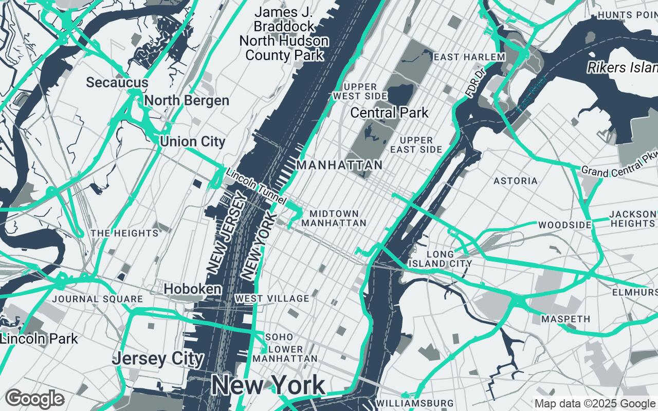
We are thrilled to introduce Spatial Blueprint, a revolutionary Google Maps visual style engineered specifically for the discerning design professional. Spatial Blueprint strips away unnecessary visual noise, presenting urban and natural landscapes with unparalleled clarity and a sophisticated, muted palette. This style is crafted for architects, urban planners, and interior designers who require a clean, functional, and aesthetically refined map view. It supports precise spatial analysis and contextual visualization, facilitating seamless integration with professional design workflows. By prioritizing essential infrastructure and contextual relationships, Spatial Blueprint enables designers to focus on their projects with an uncluttered, precise base map, transforming raw data into design inspiration.
Core Design Principles: Clarity, Context, and Functional Aesthetics
Spatial Blueprint isn't just a new color scheme; it's built upon a foundation of carefully considered design principles that resonate with the professional design community:
- Clarity over Clutter: Every element is intentionally styled to minimize visual distraction, ensuring that the most critical information stands out.
- Subtle Sophistication: The aesthetic is refined and understated, designed to complement, not compete with, your design work.
- Contextual Relevance: Elements are styled to highlight their importance in a design context, from building footprints to natural features.
- Scalable Detail: Whether zoomed out for urban planning or in for site-specific analysis, the level of detail remains appropriate and legible.
- Harmonious Integration: The style is designed to serve as a perfect base layer for your own design overlays, ensuring seamless visual harmony.
- Functional Aesthetics: Beauty is not sacrificed for utility; instead, the aesthetic choices enhance the map's functional purpose.
- Unobtrusive Guidance: Information is presented clearly but subtly, guiding the eye without overwhelming it.
Navigating the Palette: Steel-Blue, Subtle Neutrals, and Strategic Accents
The visual language of Spatial Blueprint is defined by its carefully curated palette, designed for both aesthetic appeal and functional clarity. The foundation is built upon a sophisticated steel-blue and a range of subtle neutrals, ensuring that the map provides a calm, professional backdrop for your work.
- Primary (#34495E): A deep, rich blue-grey forms the core, often used for major roads and prominent structural elements, providing a strong yet understated presence.
- Secondary (#7F8C8D): A versatile medium-dark grey complements the primary, used for less prominent roads, boundaries, and other foundational elements.
- Neutrals (#ECF0F1, #BDC3C7, #95A5A6, #2C3E50): A spectrum of light to dark greys defines land areas, water bodies, parks, and less critical infrastructure, ensuring differentiation without visual noise. These tones allow your project's details to truly pop.
- Accent (#1ABC9C): A strategic, vibrant teal is reserved for key points of interest, interactive elements, or specific data highlights. This accent color is used sparingly to draw attention precisely where it's needed, embodying the principle of unobtrusive guidance.
This palette ensures that the map is not only beautiful but also highly functional, allowing designers to quickly discern different elements and relationships within the urban fabric.
Detailed Styling: Roads, Buildings, and Natural Elements for Precision
Every feature within Spatial Blueprint has been meticulously styled to enhance precision and clarity:
- Roads: Presented with clean, crisp lines and varying widths that subtly communicate hierarchy without overwhelming the view. Textures are minimized to maintain a streamlined appearance.
- Buildings: Rendered with simplified forms and clear footprints, often in muted neutral tones. This approach provides essential contextual massing without distracting architectural details, allowing designers to easily visualize their proposed structures within the existing urban fabric.
- Natural Elements: Water bodies are depicted in a serene, light blue-grey, while parks and green spaces utilize soft green-grey tones. Terrain features, where relevant, are subtly contoured, providing geographical context without dominating the visual field. The goal is to provide a sense of place and environment that supports design decisions.
Labeling for Precision: The Art of Unobtrusive Information Delivery
In Spatial Blueprint, labels are not an afterthought; they are an integral part of the design, adhering to the principle of unobtrusive information delivery. Typography is clean, highly legible, and minimal, ensuring that text is easily readable without competing with the map's visual elements. Placement is strategic, avoiding overlap and prioritizing key information such as major street names, significant landmarks, and essential district labels. A clear hierarchy ensures that important labels stand out subtly, while less critical information recedes gracefully into the background. This meticulous approach to labeling ensures that designers receive the information they need, precisely when they need it, without visual clutter.
Integrating Spatial Blueprint with Professional Design Workflows
Spatial Blueprint is designed to be more than just a pretty map; it's a powerful tool for enhancing professional design workflows. Imagine presenting a new high-rise concept where the surrounding urban context is immediately clear and aesthetically aligned with your design. Or an urban planner analyzing traffic flow, where the uncluttered road network and subtle labeling make identifying critical intersections far more efficient. Spatial Blueprint serves as an ideal base layer for CAD, GIS, and rendering software, allowing for seamless integration of your project data. Its clean aesthetic makes it perfect for client presentations, site analysis reports, and project documentation, ensuring that your work is always presented with clarity and sophistication.
Case Studies: How Spatial Blueprint Transforms Project Visualization
- Architectural Site Analysis: A leading architectural firm used Spatial Blueprint for a complex mixed-use development. The style's clear building footprints and road hierarchy allowed them to quickly assess site access, solar paths, and contextual massing, streamlining their initial design phase and client communication.
- Urban Planning & Development: An urban planning agency adopted Spatial Blueprint for a city revitalization project. The uncluttered map enabled them to visualize proposed zoning changes, public transport routes, and green space integration with unprecedented clarity, facilitating more effective community engagement and stakeholder presentations.
- Interior Design & Local Context: An interior design studio utilized Spatial Blueprint to illustrate the local amenities and neighborhood character for a boutique hotel project. The refined aesthetic helped them convey the project's connection to its surroundings, enhancing their narrative for investors and future guests.
Future Enhancements and Customization Options for the Design Community
The journey of Spatial Blueprint is just beginning. We are committed to continuously evolving this style based on the invaluable feedback from the design community. Future enhancements will explore options for user-defined layers, allowing designers to overlay their own custom points of interest or data sets. We also envision deeper integration with specific industry data, and further customization options to tailor the palette and feature visibility to individual project needs. Your insights will help shape the next generation of design-centric mapping.
Transforming Urban Context into Design Inspiration
Spatial Blueprint is more than just a map style; it's a commitment to empowering architects, urban planners, and interior designers with a tool that truly understands their needs. By providing a foundation of precision, clarity, and aesthetic harmony, we aim to transform the way you interact with urban context, turning raw geographical data into a wellspring of design inspiration. Elevate your projects, streamline your workflows, and present your vision with the sophistication it deserves. Explore Spatial Blueprint and redefine your relationship with the world around your designs.