Spatial Blueprint: A Google Maps Style for Architectural Precision
Elevating Urban Context for Architects and Designers with Uncluttered Visuals
Spatial Blueprint: A Google Maps Style for Architectural Precision
Elevating Urban Context for Architects and Designers with Uncluttered Visuals
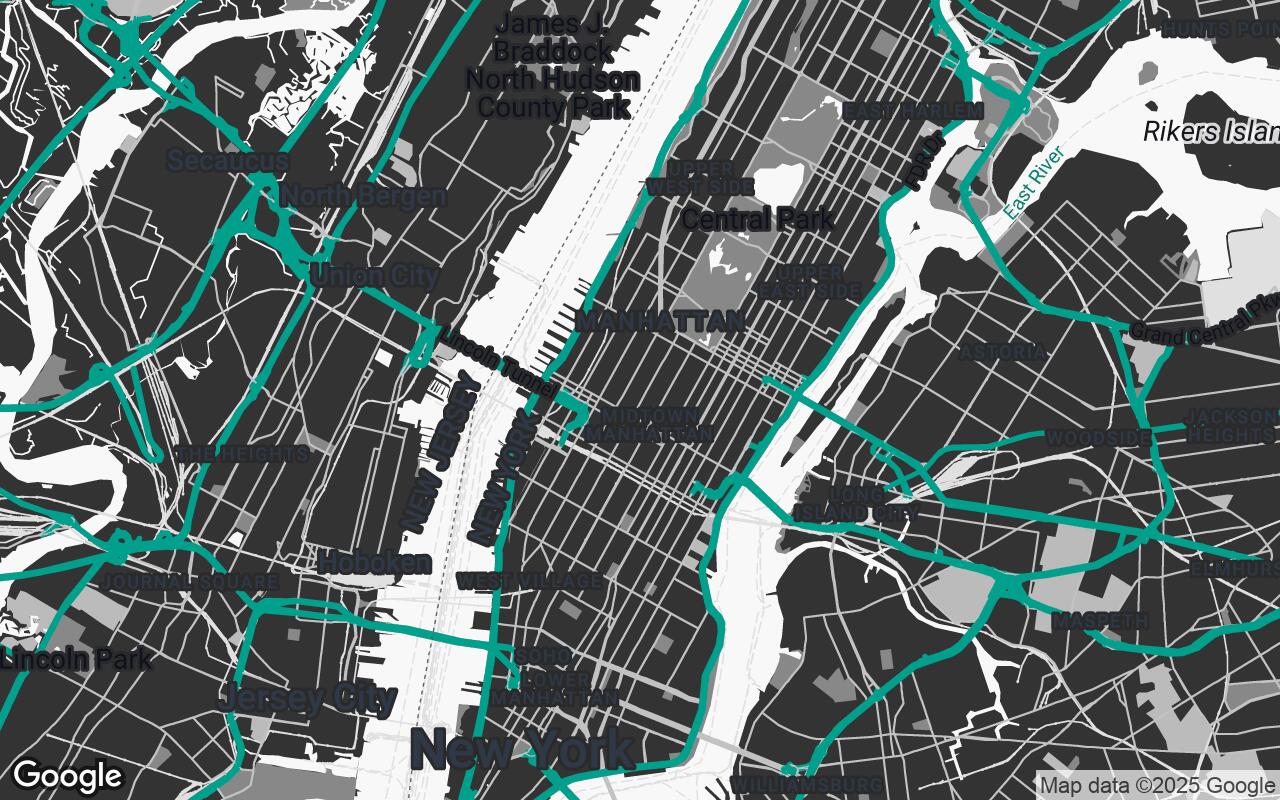
This Google Maps style, 'Spatial Blueprint,' is crafted for the discerning eye of architects and interior designers. It offers an uncluttered, high-contrast visual experience that emphasizes structural elements, topography, and material context over typical traffic or tourist information. The design aims to provide a sophisticated backdrop for project planning, site analysis, and client presentations, ensuring that essential spatial data is immediately apparent and aesthetically pleasing.
Who it's for: A meticulous architect or interior designer who requires a clean, high-contrast, and information-rich map to understand urban context, site conditions, and material palettes for their projects, prioritizing clarity and aesthetic appeal.
Introduction to Spatial Blueprint: Design Philosophy
This section explains how the style improves clarity, reduces visual noise, and preserves hierarchy so roads, water, parks, and key POIs read at a glance.
The Architect's Eye: Why Standard Maps Fall Short
This section explains how the style improves clarity, reduces visual noise, and preserves hierarchy so roads, water, parks, and key POIs read at a glance.
Key Design Principles: Clarity, Hierarchy, and Minimalism
- Clarity through Contrast: Utilize a high-contrast palette to differentiate key elements without visual clutter.
- Hierarchical Information: Prioritize architectural and urban planning data, subtly de-emphasizing less relevant details.
- Minimalist Aesthetic: Embrace clean lines and a reduced color palette to allow the project's design to take center stage.
- Contextual Awareness: Highlight building footprints, public spaces, and natural features to provide rich environmental context.
- Scalable Detail: Ensure readability and relevance across various zoom levels, from urban planning to site-specific views.
- Professional Tone: Maintain a sophisticated and understated visual language suitable for professional use.
- Material Sensitivity: Suggest material types through subtle color and texture cues where appropriate, without being overly literal.
Palette Breakdown: High Contrast for Enhanced Readability
- Primary: #F8F8F8
- Secondary: #888888
- Accent: #00796B
- Neutrals: #333333, #BBBBBB, #E0E0E0, #666666
Emphasizing the Built Environment: Buildings, Roads, and Public Spaces
This section explains how the style improves clarity, reduces visual noise, and preserves hierarchy so roads, water, parks, and key POIs read at a glance.
De-emphasizing Distractions: A Focus on Essential Data
This section explains how the style improves clarity, reduces visual noise, and preserves hierarchy so roads, water, parks, and key POIs read at a glance.
Applications: Site Analysis, Client Presentations, and Urban Planning
This section explains how the style improves clarity, reduces visual noise, and preserves hierarchy so roads, water, parks, and key POIs read at a glance.
Customization Potential: Tailoring Spatial Blueprint to Project Needs
This section explains how the style improves clarity, reduces visual noise, and preserves hierarchy so roads, water, parks, and key POIs read at a glance.
Beyond Navigation: A Tool for Design Exploration
This section explains how the style improves clarity, reduces visual noise, and preserves hierarchy so roads, water, parks, and key POIs read at a glance.