FormaMap: Redefining Google Maps for Architectural & Interior Design
A bespoke visual style that transforms spatial data into an intuitive design canvas, empowering professionals with clarity and precision for every project.
FormaMap: Redefining Google Maps for Architectural & Interior Design
A bespoke visual style that transforms spatial data into an intuitive design canvas, empowering professionals with clarity and precision for every project.
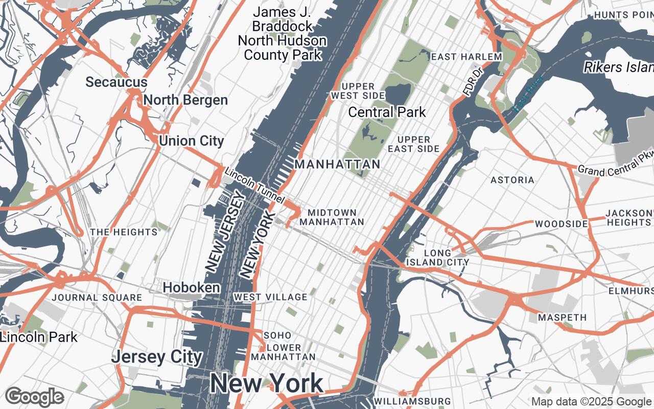
In the intricate world of architecture, interior design, and urban planning, every detail matters. From the initial site analysis to the final client presentation, professionals rely on accurate, clear, and contextually rich spatial information. Yet, for too long, the ubiquitous digital map – a cornerstone of modern information – has fallen short of meeting the nuanced demands of the design community. Standard Google Maps, while excellent for navigation, often present a visual cacophony of recreational detail, vibrant colors, and overwhelming labels that obscure the very spatial relationships and contextual nuances designers desperately need.
Enter FormaMap, a sophisticated Google Maps style meticulously crafted for the discerning eyes of architects, interior designers, and urban planners. FormaMap is not just a different color scheme; it's a fundamental reimagining of how spatial data can serve as an intuitive, uncluttered design canvas, allowing professionals to quickly grasp the essence of a location and its potential.
The Need for a Designer-Centric Map: Why Standard Google Maps Fall Short
Imagine sketching on a canvas already filled with distracting patterns and irrelevant details. This is often the experience for designers using conventional maps. While perfect for finding the nearest coffee shop or navigating traffic, their default settings are counterproductive for design workflows:
- Visual Clutter: Overly bright colors, dense points of interest, and promotional icons compete for attention, making it difficult to discern critical structural and topographical features.
- Lack of Spatial Emphasis: Roads, buildings, and natural features often blend or are rendered without the precise delineation needed to understand boundaries, scale, and relationships.
- Distracting Aesthetics: A busy, consumer-oriented aesthetic clashes with the clean, professional presentation required for design work and client communication.
- Inefficient for Analysis: Extracting meaningful design insights – such as building footprints, site access, or surrounding context – becomes a tedious exercise in filtering out noise.
These limitations necessitate a specialized approach, a map that prioritizes functional aesthetics and precise data representation over recreational detail.
Introducing FormaMap: Vision and Core Philosophy
FormaMap was born from a singular vision: to transform Google Maps into a powerful design tool. Our core philosophy is built on a set of principles that address the unique requirements of the design profession:
- Clarity over Clutter: We prioritize essential data, meticulously removing superfluous visual noise to maintain focus on design-relevant elements.
- Harmonious Palette: A refined and understated color scheme enhances readability and professionalism without being distracting.
- Spatial Emphasis: Clear delineation of boundaries, structures, and topographical features aids in understanding critical spatial relationships.
- Contextual Awareness: We provide just enough surrounding detail to understand the environment without overwhelming the primary design focus.
- Scalable Detail: Legibility and aesthetic integrity are maintained across all zoom levels, from macro urban views to micro site details.
- Functional Aesthetics: Every visual element serves a purpose, contributing to the overall utility and design-oriented interpretation of the map.
- Print-Ready Optimization: Designed to look crisp and professional whether viewed digitally or in high-quality print outputs.
FormaMap acts as a clean, professional base layer for conceptualization, site analysis, and compelling client presentations, allowing designers to quickly grasp the essence of a location and its potential.
A Palette of Purpose: Understanding FormaMap's Color Scheme
The visual language of FormaMap is defined by a carefully curated palette, designed to enhance readability and aesthetic appeal while maintaining professionalism. This is not about making the map