DesignSight Maps: The Architect's Canvas for Urban Exploration
Elevating Site Analysis and Conceptual Design with a Professional Google Maps Style
DesignSight Maps: The Architect's Canvas for Urban Exploration
Elevating Site Analysis and Conceptual Design with a Professional Google Maps Style
In the intricate world of architecture, interior design, and urban planning, every detail matters. From the grand vision of a skyscraper to the subtle nuances of a material palette, precision and context are paramount. Yet, for too long, the foundational tool of site analysis—the map—has remained largely generic, failing to meet the specialized demands of design professionals. Standard mapping services, while excellent for navigation, often present a visual cacophony of information, obscuring the very details architects and designers need to discern.
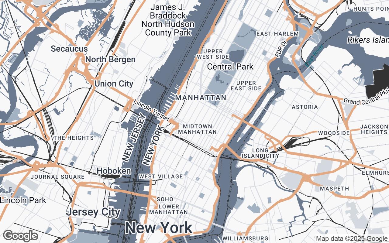
This is where DesignSight Maps emerges as a transformative solution. We've meticulously crafted a refined Google Maps style, specifically tailored for the architectural and interior design professions. DesignSight Maps prioritizes a clean, schematic aesthetic, emphasizing structural and environmental context over distracting visual clutter. It's not just a map; it's an essential tool designed to enhance site planning, inform material sourcing, and deepen understanding of the urban fabric, seamlessly integrating into professional design workflows and presentations.
Understanding the Architect's Perspective: Beyond Standard Maps
For architects and designers, a map is far more than a guide from point A to point B. It's a canvas for conceptualization, a database for site constraints, and a narrative tool for client presentations. Standard maps, with their vibrant colors, dense POI (Points of Interest) labels, and often overwhelming detail, frequently hinder rather than help this process.
Imagine trying to analyze the subtle grade changes of a site, the relationship between existing building masses, or the flow of pedestrian traffic, all while contending with a riot of fast-food icons and tourist attractions. This visual noise forces designers to mentally filter out irrelevant information, a time-consuming and error-prone task. What's needed is a map that speaks the language of design—one that highlights form, structure, and context with clarity and professional elegance.
Key Design Principles of DesignSight Maps: Clarity, Context, and Professionalism
DesignSight Maps is built upon a foundation of principles that directly address the unique needs of design professionals:
- Clarity over Clutter: We ruthlessly minimize non-essential elements, ensuring that only critical design context is highlighted. This means fewer distracting icons and more focus on the built environment.
- Schematic Representation: Our visual language is simplified, almost diagrammatic. This approach helps designers quickly grasp spatial relationships and structural forms without being bogged down by hyper-realistic textures.
- Contextual Emphasis: Features most relevant to site analysis and urban planning—such as building footprints, topographical lines, and infrastructure—are given visual prominence.
- Professional Aesthetics: DesignSight Maps maintains a sophisticated, understated visual tone. It's designed to complement, not compete with, your design work, making it ideal for high-stakes client presentations.
- Scalable Detail: Whether you're zoomed out for a regional overview or in for a detailed site plan, readability and utility are maintained across all zoom levels.
- Layered Information: Different data types are easily distinguishable, allowing for quick interpretation of complex urban environments.
- Subtle Contrast: We utilize a refined color palette for clear differentiation without harshness, reducing eye strain during long analysis sessions.
A Deep Dive into the Visual Palette: Colors that Communicate, Not Distract
The color palette of DesignSight Maps is a deliberate departure from the typical. Instead of bright, attention-grabbing hues, we've opted for a sophisticated, muted scheme that supports focused analysis. Our palette is designed to communicate information effectively without overwhelming the eye:
- Primary Tones (e.g., a deep, calming blue-gray): These form the backbone of the map, providing a stable and professional base for land and major features.
- Secondary Hues (e.g., a lighter, airy blue-gray): Used for water bodies and less dominant features, these colors offer gentle contrast and depth.
- Neutrals (e.g., soft off-whites, light grays, and deep charcoal): These are extensively used for roads, building masses, and background elements, ensuring a clean, uncluttered appearance. The subtle variations in these neutrals allow for clear differentiation of surfaces and structures without visual noise.
- Accent Color (e.g., a warm, earthy terracotta): This is reserved for highlighting specific, critical elements or points of interest that require immediate attention, providing a gentle visual anchor without being jarring.
This carefully curated palette ensures that the map serves as a supportive backdrop, allowing your design concepts to take center stage.
Styling Elements: Roads, Buildings, and Water for Design-Focused Analysis
Every element within DesignSight Maps has been re-envisioned through the lens of architectural utility:
Roads and Infrastructure
Roads are rendered with a schematic simplicity, using varying shades of neutral gray to denote hierarchy without excessive detail. Major arteries are clearly distinguishable, while smaller streets recede appropriately, allowing the urban grid to be understood as a structural element rather than a navigational path. Pedestrian zones and pathways are subtly indicated, aiding in understanding human flow and accessibility.
Buildings and Urban Fabric
Building footprints are a cornerstone of DesignSight Maps. Rendered in a clean, uniform neutral, they immediately convey massing and density. This allows architects to quickly assess existing urban fabric, identify potential adjacencies, and understand the volumetric context of a site. The emphasis is on form and spatial relationship, not on individual building details that might distract from the larger design challenge.
Water Bodies and Natural Features
Water features, from vast oceans to intricate rivers, are depicted with a serene, lighter blue-gray, providing a calming contrast to the built environment. Green spaces, parks, and natural landscapes are rendered in a soft, desaturated green, indicating their presence and extent without competing with the architectural elements. This ensures that environmental context is clear, aiding in sustainable design considerations and landscape integration.
Optimizing Labels and POIs for Architectural Relevance
One of the most significant improvements in DesignSight Maps is the intelligent handling of labels and Points of Interest. Gone are the overwhelming clusters of commercial icons. Instead, labels are:
- Minimalist and Contextual: Only essential labels are displayed, such as major street names, significant public buildings, or key landmarks that provide vital orientation.
- Hierarchical: Label visibility scales intelligently with zoom levels, ensuring that information is always relevant to the current view.
- Professionally Styled: Typography is clean, legible, and understated, aligning with the overall aesthetic.
This approach ensures that the map remains uncluttered, allowing designers to focus on the spatial and structural information that truly matters for their work.
Practical Applications: From Site Selection to Client Presentations
DesignSight Maps is an invaluable asset across the entire design lifecycle:
- Site Selection and Analysis: Quickly identify optimal sites by assessing existing infrastructure, building density, green spaces, and topographical features with unparalleled clarity.
- Conceptual Design: Use the clean base map to sketch initial ideas, understand massing, and explore urban relationships without visual interference.
- Material Sourcing: Gain a clearer understanding of local context that might influence material choices, such as proximity to natural resources or existing architectural styles.
- Urban Planning and Contextual Studies: Analyze the broader urban fabric, identify development opportunities, and understand the impact of proposed designs on the surrounding environment.
- Client Presentations: Present site analysis and design concepts on a professional, aesthetically pleasing map that reinforces your expertise and attention to detail. The map becomes a sophisticated backdrop, allowing your design to shine.
Implementing DesignSight Maps: A Guide to Google Styled Maps
Integrating DesignSight Maps into your workflow is straightforward. As a Google Styled Map, it leverages the robust and familiar Google Maps platform. This means you can apply the DesignSight style to your existing Google Maps implementations, whether for web applications, interactive kiosks, or static image exports for reports and presentations. The style can be easily loaded and applied, transforming your maps with minimal effort and maximum impact.
Case Studies: How DesignSight Maps Enhances Real-World Projects
Imagine an architectural firm tasked with designing a new cultural center in a dense urban environment. With standard maps, the team might spend hours sifting through irrelevant data, struggling to visualize the building's relationship to historical landmarks, public transport hubs, and pedestrian flows. With DesignSight Maps, these critical elements are immediately apparent. The clean building footprints allow for quick massing studies, the subtle road hierarchy clarifies access points, and the muted palette ensures that the proposed design stands out against a professional, contextual backdrop.
Similarly, an interior designer planning a large-scale commercial fit-out can use DesignSight Maps to understand the building's immediate surroundings, identifying natural light sources, views, and the character of the neighborhood—all crucial for informing material choices and spatial planning. The map becomes a silent, intelligent partner, guiding design decisions with clarity and precision.
Conclusion: The Future of Contextual Mapping for Designers
DesignSight Maps represents a significant leap forward in contextual mapping for the design professions. By prioritizing clarity, schematic representation, and professional aesthetics, we've created a tool that not only streamlines site analysis but also elevates the entire design process. It empowers architects, interior designers, and urban planners to see their sites with new eyes, to understand urban environments more deeply, and to present their visions with unparalleled sophistication.
Step into the future of design with DesignSight Maps—where every pixel is designed to enhance your perception, inform your decisions, and inspire your creations. Your canvas for urban exploration just got a professional upgrade.