Blueprint Canvas: Reimagining Google Maps for the Design Professional
An in-depth look at a bespoke map style engineered for architects and interior designers, transforming digital cartography into a powerful design tool.
Blueprint Canvas: Reimagining Google Maps for the Design Professional
An in-depth look at a bespoke map style engineered for architects and interior designers, transforming digital cartography into a powerful design tool.
The Designer's Dilemma: Why Standard Maps Fall Short for Architectural and Interior Design Needs
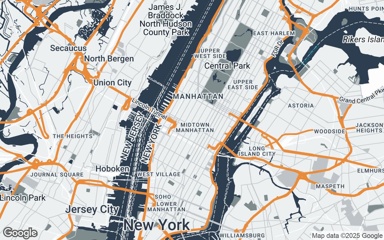
For architects, interior designers, and urban planners, the foundational understanding of a site's context is paramount. Yet, the standard digital maps we've grown accustomed to, while excellent for navigation, often fall short of professional design requirements. Default Google Maps, with its vibrant array of points of interest (POIs), bustling labels, and consumer-centric aesthetic, can quickly become a visual cacophony when what's truly needed is clarity and structural insight.
Imagine trying to analyze building footprints, understand street networks, or conceptualize a new urban intervention amidst a sea of coffee shop icons and tourist attractions. This visual noise distracts from the critical spatial relationships and underlying urban fabric that form the bedrock of any design project. Designers need a map that acts as a clean canvas, highlighting essential data without imposing a strong, often irrelevant, aesthetic. They require a tool that supports focused analysis, not just basic wayfinding. This is the dilemma Blueprint Canvas was engineered to solve.
Introducing Blueprint Canvas: A New Vision for Spatial Context
Enter Blueprint Canvas, a revolutionary new Google Maps style meticulously crafted for the discerning design professional. This isn't just a color swap; it's a complete reimagining of digital cartography, tailored to serve as a foundational layer for architects, urban planners, and interior designers. Blueprint Canvas prioritizes a professional, minimalist aesthetic, emphasizing clarity, structural context, and a sophisticated visual hierarchy.
Our mission with Blueprint Canvas is to transform Google Maps from a navigation utility into a powerful design instrument. It allows users to quickly grasp urban fabric, site conditions, and design opportunities by presenting information in a way that resonates with the design process. The palette is intentionally subdued yet warm, providing an ideal backdrop for design conceptualization and client presentations, fostering an environment of focused analysis and creative inspiration.
Unpacking the Palette: The Psychology of Warm Tones and Professional Hues in Design
The visual language of Blueprint Canvas is deeply intentional, built upon a sophisticated palette designed to be both professional and inviting. We've moved away from the often stark or overly bright default map styles, opting instead for a harmonious blend of warm tones and professional hues.
- Primary (
#2C3E50): A deep, authoritative blue-gray that grounds the map, providing a sense of stability and professionalism. It's the color of blueprints themselves, evoking precision and planning. - Secondary (
#7F8C8D): A softer, muted gray that complements the primary, used for less critical but still important features, maintaining visual harmony. - Accent (
#E67E22): A vibrant yet sophisticated orange, strategically used to highlight key elements or provide subtle visual cues without overwhelming the user. It adds a touch of warmth and dynamism. - Neutrals (
#ECF0F1,#BDC3C7,#FDFDFD,#D0D3D4): A range of light grays and off-whites that form the bulk of the map's background, ensuring a clean, uncluttered canvas. These tones are specifically chosen to be visually quiet, allowing design overlays to stand out without competition.
This