Beyond Navigation: Crafting Spatial Intelligence for Design Professionals
Introducing Aetheria Maps: A Google Maps Style Guide for Architects and Interior Designers
Beyond Navigation: Crafting Spatial Intelligence for Design Professionals
Introducing Aetheria Maps: A Google Maps Style Guide for Architects and Interior Designers
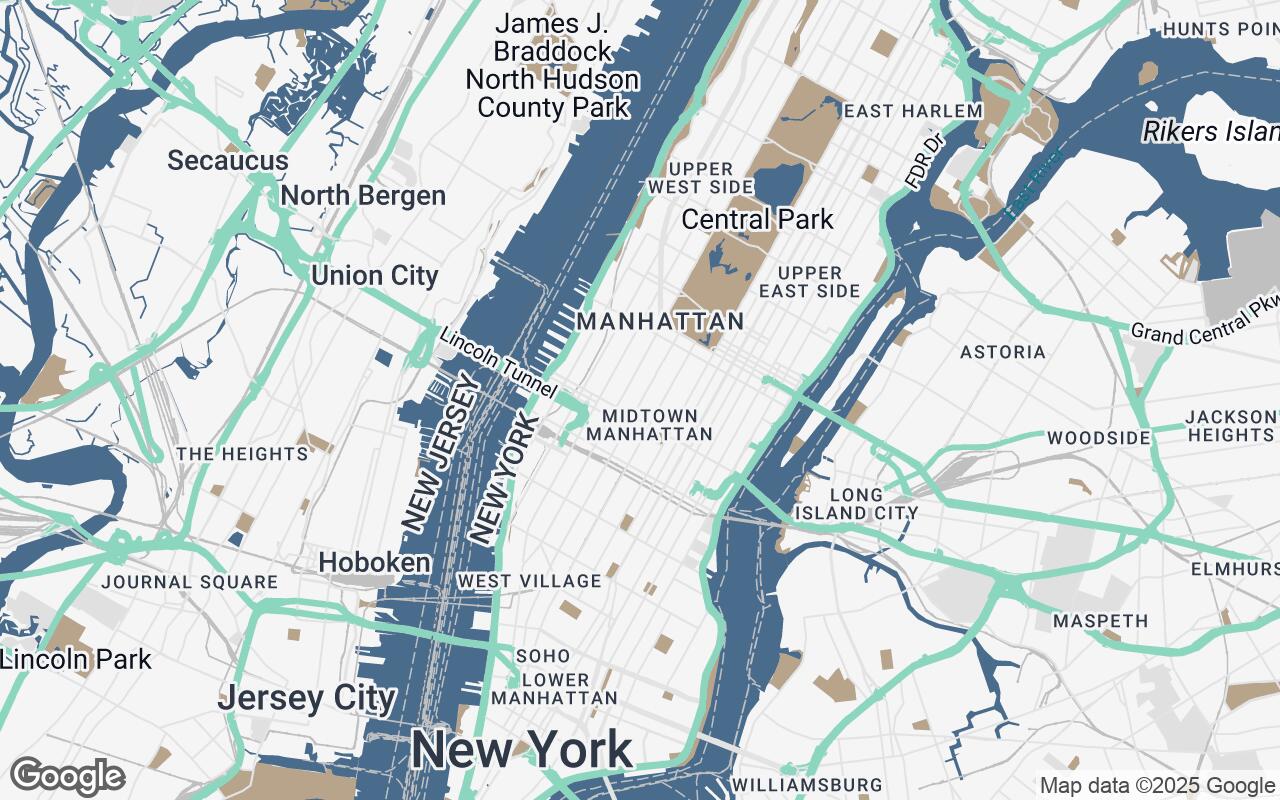
For architects, interior designers, and urban planners, a map is far more than a simple guide from point A to point B. It's a foundational canvas, a critical tool for understanding context, visualizing potential, and communicating complex spatial ideas. Yet, the standard mapping interfaces, designed for general navigation, often fall short. Their visual language, optimized for driver-centric clarity, can obscure the nuanced details crucial for design professionals, presenting a cacophony of information rather than a coherent spatial narrative.
The Designer's Imperative: Why Standard Maps Fall Short
Imagine an architect scouting a new site, an interior designer conceptualizing a commercial space, or an urban planner assessing public realm opportunities. What do they need from a map? Not just streets and addresses, but a profound understanding of:
- Urban Fabric: How buildings relate to each other, their massing, setbacks, and the rhythm of the streetscape.
- Contextual Elements: The presence of green spaces, water features, pedestrian zones, and public amenities that define an area's character.
- Spatial Relationships: The interplay of light and shadow, the hierarchy of spaces, and the flow of movement.
- Aesthetic Harmony: A visual representation that complements, rather than clashes with, their own design sensibilities.
Standard maps, with their often vibrant, sometimes overwhelming, color schemes and emphasis on vehicular routes, can struggle to deliver this level of insight. They prioritize immediate navigation over deep spatial analysis, leaving designers to mentally filter out noise and reconstruct the urban environment in their minds.
Aetheria Maps: A New Vision for Spatial Understanding
Enter Aetheria Maps, a bespoke Google Maps visual style meticulously crafted for the discerning eye of architects, interior designers, and urban planners. Aetheria Maps transforms the familiar mapping interface into a sophisticated and functional canvas, prioritizing clarity, aesthetic appeal, and the specific details that empower design professionals.
Our persona for Aetheria Maps is clear: it is designed for those who require a visually precise and aesthetically refined interpretation of urban and interior landscapes. It empowers professionals to visualize spatial relationships, contextualize designs, and communicate complex ideas with clarity and elegance. Aetheria is not just about seeing where things are; it's about understanding how they are, and what they could be.
Core Design Principles: Clarity, Precision, and Aesthetic Harmony
Every element within Aetheria Maps is guided by a set of core design principles, ensuring that the map serves as an intuitive extension of the design process:
- Clarity over clutter: We prioritize essential information, minimizing visual noise. Irrelevant details are subdued or removed, allowing critical architectural and urban features to emerge.
- Subtle materiality: Aetheria suggests texture and depth through nuanced color and shading, giving a tactile sense to the built environment without resorting to photorealism.
- Contextual awareness: The style emphasizes the relationship between buildings, public spaces, and infrastructure, fostering a holistic understanding of the site.
- Precision and accuracy: Expect crisp lines and clear delineation of features, crucial for accurate measurements and spatial planning.
- Aesthetic integration: Aetheria employs harmonious color palettes and typography that complement design sensibilities, making the map a pleasure to work with and present.
- Layered information: The design allows for easy toggling of specific data relevant to design, ensuring flexibility in information display.
- Scalability: Visual integrity and readability are maintained across various zoom levels, from the broad urban plan to detailed site analysis.
The Aetheria Palette: Color as a Strategic Communication Tool
The color palette of Aetheria Maps is deliberately chosen to enhance spatial understanding and provide a sophisticated visual experience. It moves away from the bright, often distracting, hues of standard maps towards a more refined and functional spectrum.
- Primary (
#4A6C8C): A deep, calming blue, reminiscent of architectural blueprints, used for key water features and significant infrastructure, providing a stable foundation. - Secondary (
#B8A38B): A warm, earthy tone that subtly defines landmasses, parks, and natural elements, offering a gentle contrast to the built environment. - Accent (
#7FD1B9): A fresh, vibrant teal, strategically used to highlight points of interest, critical pathways, or user-defined areas, drawing the eye without overwhelming. - Neutrals (
#F5F5F5,#E0E0E0,#C0C0C0,#808080): A gradient of sophisticated grays forms the backbone of the map, defining roads, buildings, and general urban fabric. These muted tones allow architectural forms and contextual details to take precedence, providing a sense of depth and subtle materiality.
This palette ensures that the map is not only functional but also visually harmonious, making it an ideal backdrop for design conceptualization and presentation.
Styling Buildings and Urban Fabric for Architectural Insight
Aetheria Maps redefines how buildings and urban spaces are rendered. Instead of flat, undifferentiated blocks, buildings are given subtle depth through intelligent shading and nuanced color variations from the neutral palette. This allows for an immediate understanding of massing and density. Roads are depicted with a clean, hierarchical structure, emphasizing pedestrian zones and public squares over vehicular thoroughfares when appropriate.
- Building Footprints: Clearly defined with crisp edges, offering a precise outline for site planning.
- Green Spaces: Rendered in soft, inviting tones of the secondary color, making parks and plazas easily identifiable and inviting.
- Water Bodies: Displayed with the primary blue, offering a sense of calm and clarity.
This approach transforms the map into a legible diagram of the urban environment, where the built and natural elements articulate a clear spatial narrative.
Optimizing Labels and POIs for Professional Workflow
Labels and Points of Interest (POIs) in Aetheria Maps are reimagined to support professional workflows. Typography is clean, legible, and unobtrusive, ensuring that text enhances rather than detracts from the visual information. POIs are carefully curated, focusing on elements relevant to design professionals:
- Contextual POIs: Highlighting architectural landmarks, public art installations, cultural institutions, and significant public transport hubs.
- Minimizing Distraction: General commercial POIs are subdued or only appear at higher zoom levels, reducing visual clutter.
- Customization: The ability to easily toggle specific categories of POIs allows designers to tailor the map to their immediate needs, focusing on, for example, material suppliers or structural engineers in the vicinity.
Enhancing Collaboration and Presentation with Aetheria's Visual Language
For design professionals, communication is paramount. Aetheria Maps provides a consistent, professional visual language that elevates presentations and facilitates clearer collaboration. When a project team or client views a site through Aetheria, they immediately grasp the critical spatial relationships and contextual nuances. The map becomes an elegant, credible backdrop for design discussions, ensuring everyone is literally on the same page.
- Professional Aesthetics: The refined look of Aetheria Maps instantly conveys professionalism and attention to detail.
- Clear Communication: Reduced clutter and strategic highlighting ensure that key design points are easily understood.
- Shared Understanding: A common, visually intelligent base for all project stakeholders.
Future Possibilities: Integrating Materiality and Data Layers for Deeper Analysis
The vision for Aetheria Maps extends beyond its current capabilities. We envision future iterations that integrate even deeper layers of spatial intelligence:
- Materiality Overlays: Imagine a layer that suggests predominant building materials in an area, aiding in contextual material selection.
- Environmental Data: Integration of solar path analysis, wind patterns, or noise pollution data directly onto the map.
- Zoning and Regulatory Information: A direct, visual representation of planning constraints and opportunities.
Aetheria Maps is more than just a style guide; it's a commitment to empowering design professionals with the spatial tools they truly need. It's about moving beyond navigation to crafting a deeper, more intelligent understanding of our built world, one pixel at a time. Embrace Aetheria Maps and transform your approach to site analysis, conceptual design, and client presentations.