Archisense: Redefining Urban Context for Architectural Design
A Google Maps Style Tailored for Architects and Interior Designers to Enhance Site Analysis and Presentation
Archisense: Redefining Urban Context for Architectural Design
A Google Maps Style Tailored for Architects and Interior Designers to Enhance Site Analysis and Presentation
In the intricate world of architectural and interior design, understanding context is paramount. Every structure, every space, is a response to its surroundings – the urban fabric, the natural landscape, the flow of human activity. For decades, maps have been an indispensable tool, yet traditional mapping solutions often fall short, presenting a cacophony of information designed for navigation, not nuanced design analysis.
The Evolving Role of Maps in Architectural Practice
Architects, interior designers, and urban planners constantly grapple with complex site conditions. From initial feasibility studies to detailed design development, the ability to visualize and interpret spatial relationships, material palettes, and environmental factors is critical. Standard maps, with their vibrant tourist attractions, traffic overlays, and overwhelming points of interest, frequently obscure the very details designers need most: building footprints, public realm definitions, and the subtle textures of the urban environment. This forces professionals to spend valuable time filtering out noise, rather than focusing on insight.
Introducing Archisense: A Designer's Perspective
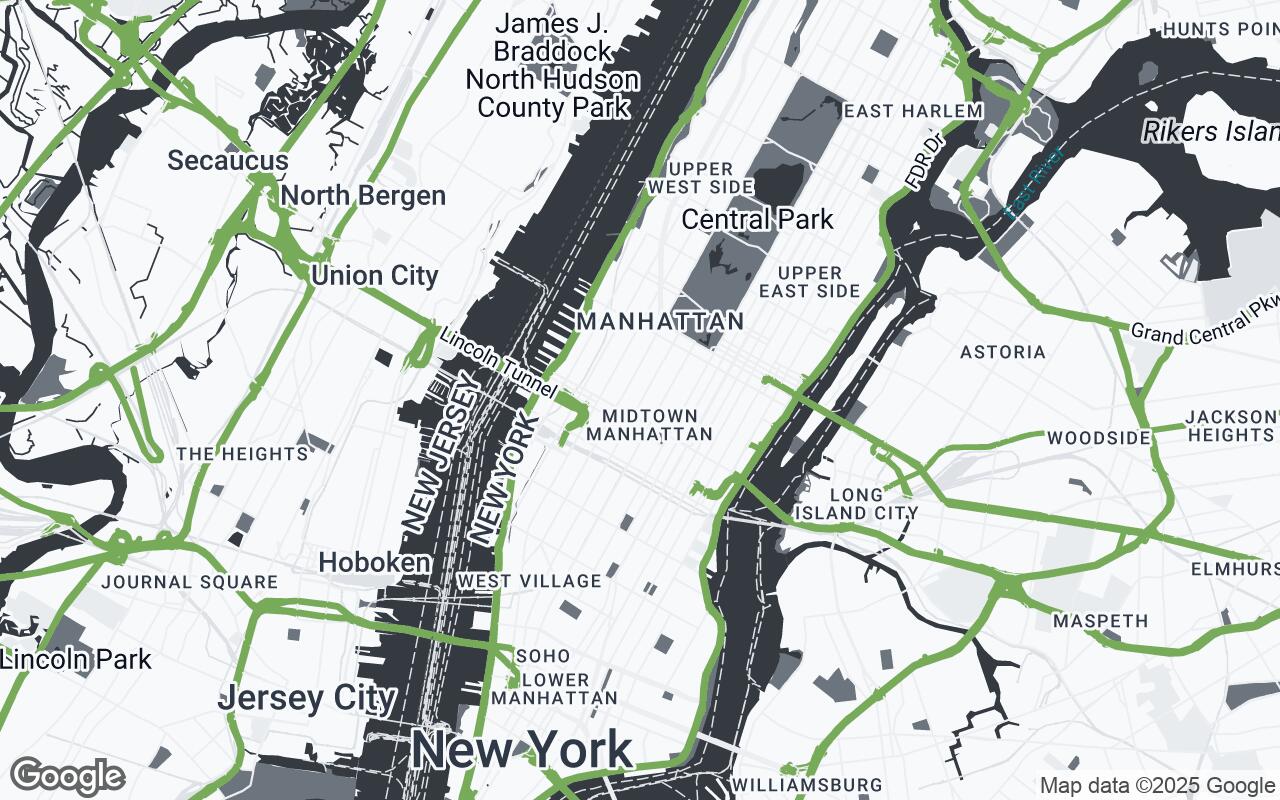
We are thrilled to introduce Archisense, a sophisticated Google Maps style meticulously crafted to empower architects, interior designers, and urban planners. Archisense is not just a map; it's a design tool, providing a minimalist yet information-rich visual context that transforms how professionals engage with their project sites. It's built for those who prioritize spatial relationships and material context over typical navigation cues, turning a map into an essential canvas for design inspiration and rigorous analysis.
Archisense reduces visual clutter, allowing you to focus on the critical elements that inform design decisions. Imagine a map where building footprints are clearly delineated, public spaces are subtly highlighted, and the underlying material characteristics of an urban block are hinted at through a refined color palette. This is the vision behind Archisense.
Key Design Principles: Clarity, Minimalism, and Context
Archisense is built upon a foundation of core design principles, each meticulously applied to serve the unique needs of the design community:
- Contextual Clarity: Emphasize relevant urban and architectural data while minimizing distractions. Every element serves a purpose, enhancing understanding without overwhelming the eye.
- Sophisticated Minimalism: A clean, elegant aesthetic that complements professional design work. The style is understated, ensuring your design concepts remain the focal point.
- Material Resonance: Hint at underlying material characteristics through subtle color and texture cues. This allows for a more intuitive understanding of the existing built environment.
- Spatial Hierarchy: Use visual weight to denote important structures and public spaces, guiding the eye to key areas of interest and influence.
- Print-Ready Fidelity: Optimized for both digital viewing and high-quality print outputs, ensuring your presentations look impeccable in any medium.
- Adaptable Palette: A flexible color scheme that can integrate seamlessly with various design project aesthetics, providing a neutral yet informative backdrop.
- Data-Driven Focus: Prioritize data that truly informs design decisions, such as building heights, land use, and pedestrian pathways, rather than general navigation points.
Visual Hierarchy: Prioritizing Architectural Elements
One of Archisense's most powerful features is its intelligent visual hierarchy. Instead of a flat, undifferentiated landscape, Archisense carefully prioritizes information. Major building footprints are rendered with a subtle prominence, allowing for immediate recognition of massing and urban density. Public parks and plazas are gently highlighted, emphasizing their role as vital urban lungs and gathering spaces. Roads and infrastructure are present but subdued, providing necessary context without dominating the view. This thoughtful layering ensures that the most architecturally relevant data rises to the forefront, enabling quicker, more accurate site assessments.
The Archisense Palette: Sophistication in Subtlety
The aesthetic appeal of Archisense lies in its carefully curated color palette, designed for sophistication and clarity:
- Accent (
#6A994E): A refined green, used sparingly to highlight key features or points of interest, drawing attention without being garish. - Neutrals (
#F8F9FA,#E9ECEF,#DEE2E6,#CED4DA,#ADB5BD): A spectrum of soft grays and off-whites form the backbone of the map, providing a clean, unobtrusive canvas. These subtle variations differentiate land use, water bodies, and less critical urban elements, contributing to the 'Material Resonance' principle. - Primary (
#343A40): A deep, professional charcoal for primary text and important labels, ensuring readability and a strong visual presence. - Secondary (
#6C757D): A softer gray for secondary labels and less critical text, maintaining hierarchy and reducing visual noise.
This palette ensures that Archisense maps are not only highly functional but also aesthetically pleasing, complementing professional design documents and presentations.
Beyond Navigation: Leveraging Archisense for Site Analysis
Archisense transforms the map from a simple locator into a dynamic analytical tool. Imagine:
- Understanding Sun Paths and Wind Patterns: By clearly delineating building heights and orientations, designers can better assess solar exposure and prevailing winds, crucial for sustainable design.
- Analyzing Pedestrian Flow: Subtly rendered pathways and public spaces help visualize potential pedestrian routes and congregation points, informing urban design and public realm interventions.
- Material Context: The nuanced palette hints at the material characteristics of surrounding buildings and landscapes, aiding in material selection and contextual integration.
- Zoning and Massing Studies: The clean presentation of building footprints and property lines makes it easier to conduct initial massing studies and understand zoning envelopes.
Integrating Archisense into Client Presentations
First impressions matter. Presenting your design in the context of an Archisense map immediately elevates the professionalism and clarity of your client presentations. Its clean aesthetic and focused information allow clients to grasp the site's complexities and your design's response to them without distraction. The 'Print-Ready Fidelity' ensures that whether projected on a screen or printed on a large board, the map maintains its crispness and legibility, reinforcing your expertise and attention to detail.
Customization and Future Enhancements
While Archisense offers a refined default experience, we understand the need for flexibility. Future enhancements will include options for designers to toggle specific data layers – perhaps highlighting public transport routes for a transit-oriented development, or overlaying demographic data for a community project. Our goal is to make Archisense an adaptable platform that grows with the evolving needs of the design profession.
Case Studies: Archisense in Action
- The Urban Revitalization Project: An architectural firm used Archisense to analyze a neglected downtown block. The clear delineation of historic building footprints and the subtle highlighting of a forgotten public alleyway immediately revealed opportunities for adaptive reuse and pedestrian activation, which were overlooked with standard maps.
- The Boutique Hotel Interior: An interior design studio, tasked with a hotel renovation, leveraged Archisense to understand the surrounding streetscape and local material palette. This informed their facade design and material choices, ensuring the hotel felt deeply integrated into its neighborhood's character.
- The Waterfront Master Plan: Urban planners utilized Archisense to visualize the relationship between proposed public parks, existing residential zones, and the natural waterfront. The minimalist style allowed them to focus on ecological corridors and public access points, leading to a more cohesive and sustainable master plan.
Conclusion: Elevating Design Through Contextual Mapping
Archisense represents a significant step forward in providing design professionals with the tools they truly need. By stripping away the superfluous and highlighting the essential, it empowers architects, interior designers, and urban planners to engage with their sites on a deeper, more informed level. It's more than just a map style; it's a commitment to clarity, context, and design excellence. Elevate your site analysis, refine your presentations, and inspire your next masterpiece with Archisense – where every pixel tells a design story.