Archimetric View: The Google Maps Style Redefining Spatial Context for Design Professionals
Elevating Precision and Aesthetic Clarity in Urban Cartography for Architects and Interior Designers.
Archimetric View: The Google Maps Style Redefining Spatial Context for Design Professionals
Elevating Precision and Aesthetic Clarity in Urban Cartography for Architects and Interior Designers.
In the intricate worlds of architecture, urban planning, and interior design, every line, every shade, and every spatial relationship holds profound significance. Yet, when designers turn to conventional mapping tools for site analysis or contextual understanding, they often encounter a visual cacophony. Standard Google Maps, while indispensable for navigation, are designed for the general public, prioritizing points of interest and vibrant color schemes that, for a design professional, can obscure rather than illuminate critical urban fabric.
This is where the need for a designer-centric map becomes an imperative. Architects and planners require a canvas that is not only accurate but also aesthetically intelligent – a map that speaks their language of structure, form, and subtle detail. They need a tool that strips away visual noise, allowing the underlying geometry and infrastructure to emerge with uncompromised clarity. The limitations of standard maps – their busy palettes, overwhelming POI markers, and often distracting natural features – have long left a gap in the professional toolkit. Until now.
Introducing Archimetric View: A Philosophy of Precision and Purpose
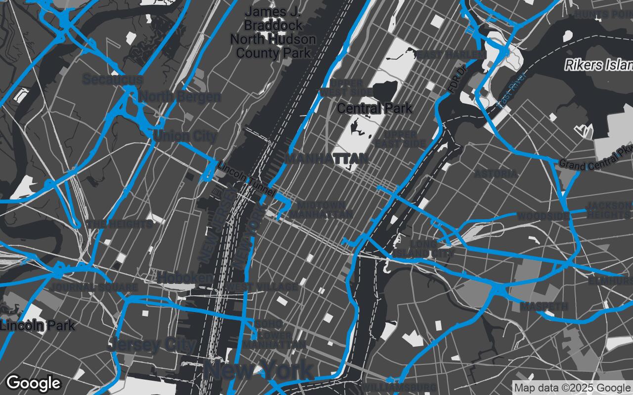
We are thrilled to introduce Archimetric View, a groundbreaking Google Maps style specifically engineered to meet the stringent demands of design professionals. Archimetric View is more than just a new color scheme; it's a philosophy of spatial representation, designed to provide a clean, precise, and aesthetically refined spatial context that emphasizes structural elements and human-made environments over natural features. It supports detailed analysis and presentation of design concepts within their urban fabric.
Archimetric View offers a sophisticated Google Maps aesthetic, stripping away visual clutter and highlighting critical infrastructure, building footprints, and street networks with unparalleled clarity. Its muted palette and precise rendering ensure that geographical context enhances rather than distracts from architectural and interior design projects, making it the ideal foundation for any design endeavor.
Core Design Principles: Clarity, Structure, and Subdued Sophistication
The development of Archimetric View was guided by a set of unwavering principles, each meticulously crafted to serve the unique needs of design professionals:
- Uncompromised Clarity: Prioritizing legibility and information hierarchy above all, ensuring that essential data is immediately discernible.
- Architectural Precision: Emphasizing structural forms, building footprints, and man-made elements with crisp, defined lines.
- Subdued Sophistication: Utilizing a refined, professional color palette that is elegant and unobtrusive, allowing your designs to take center stage.
- Contextual Relevance: Providing essential urban detail without visual noise, focusing on what matters most for design analysis.
- Data-Driven Aesthetics: Ensuring that all design choices support analytical needs, making the map a powerful tool for informed decision-making.
- Adaptable Foundation: Serving as a neutral, versatile canvas for seamlessly overlaying design data, plans, and visualizations.
- Minimalist Elegance: Achieving maximum impact through restraint and thoughtful detail, where every element serves a purpose.
The Archimetric Palette: A Symphony of Charcoal, Grey, and Architectural Blue
At the heart of Archimetric View's distinctive aesthetic is its carefully curated color palette, a sophisticated blend designed for both visual appeal and functional clarity. The primary color, a deep charcoal (#2C2F33), forms the backbone of the map, defining major roads and building outlines with a commanding yet understated presence. This rich, near-black hue provides a strong foundation without the harshness of pure black.
Complementing this, a range of refined neutrals – including #4A4A4A, #808080, #C2C2C2, and #F5F5F5 – are deployed for secondary roads, building fills, landmass, and subtle text. These varying shades of grey create depth and hierarchy, ensuring that different elements are distinct yet harmonious. A lighter secondary background color (#E0E0E0) further enhances legibility, providing a gentle contrast.
Adding a touch of strategic vibrancy is the architectural blue accent (#0077B6). This purposeful hue is reserved for critical highlights, such as water bodies and specific points of interest that require emphasis, ensuring they stand out without overwhelming the overall subdued sophistication of the map.
Deconstructing the Visuals: How Roads, Buildings, and Labels are Transformed
Every element within Archimetric View has been re-imagined through the lens of architectural utility:
Roads and Infrastructure
Road networks are rendered with clean, precise lines, their hierarchy clearly defined through varying weights and subtle tonal shifts. Freeway interchanges, arterial roads, and local streets are instantly distinguishable, providing a clear understanding of urban circulation without the distraction of overly saturated colors or heavy textures. Road labels are minimalist, placed strategically to avoid clutter.
Buildings and Urban Fabric
Building footprints are emphasized with crisp outlines against muted fills, allowing designers to quickly grasp the density and scale of the built environment. Where 3D representations are available, they are presented in a simplified, structural form, enhancing spatial understanding without decorative flourishes. This focus on form and mass is crucial for site analysis and contextual planning.
Labels and Points of Interest
Labels are meticulously chosen and placed, utilizing a clear, professional typeface in neutral tones. The number of visible points of interest (POIs) is significantly reduced, prioritizing only those most relevant to design professionals, such as major public buildings, transport hubs, or significant landmarks. This ensures that the map remains a clean slate for your project-specific annotations.
Natural Features
Water bodies are depicted using the distinctive architectural blue, providing a clear visual anchor. Parks and green spaces are rendered in muted greens or subtle grey-green tones, indicating their presence without drawing excessive attention away from the built environment. Topographical lines, if present, are subtle and understated, serving as background information rather than foreground spectacle.
Enhancing Workflow: Integrating Archimetric View into Design Software and Presentations
Archimetric View isn't just for viewing; it's designed to be an integral part of your design workflow. Imagine:
- Site Analysis: Instantly gaining a clear understanding of a project site's context, identifying key adjacencies, access points, and urban relationships.
- Base for Overlays: Using Archimetric View as a pristine, neutral canvas onto which you can overlay your own CAD drawings, GIS data, or conceptual sketches without visual interference.
- Professional Presentations: Creating compelling client presentations where the geographical context is elegant, professional, and enhances your design narrative, rather than detracting from it. Its aesthetic seamlessly integrates with architectural renderings and interior mood boards.
Through Google Maps Platform APIs, Archimetric View can be integrated into custom web applications, GIS platforms, and even serve as an exportable base layer for popular design software, streamlining the process of contextualizing your projects.
Case Studies: Real-World Applications
Urban Planning & Master Planning
For an urban planner, Archimetric View transforms the process of visualizing a new district master plan. By providing a clear, unadorned view of existing infrastructure, zoning boundaries, and potential development sites, it allows for swift identification of opportunities and constraints. Imagine overlaying proposed transit lines or green infrastructure networks onto Archimetric View – the clarity ensures that every proposed change is seen in precise relation to the existing urban fabric, facilitating more informed decisions.
Interior Project Siting & Logistics
Interior designers often need to understand the immediate surroundings of a building for material sourcing, logistical planning, or even for understanding views and light exposure. Archimetric View allows for a precise understanding of the building's street-level context, nearby amenities, and access routes, which can be critical for planning deliveries, understanding neighborhood character for material selection, or even for preliminary sun path analysis.
Customization and Flexibility: Adapting the Style for Specific Project Needs
While Archimetric View offers a meticulously crafted default experience, its