Aetherial Maps: Crafting the Ideal Google Maps Style for Architectural Vision
Unveiling a minimalist, precise, and aesthetically refined map experience designed to empower architects and interior designers in their spatial analysis and presentation workflows.
Aetherial Maps: Crafting the Ideal Google Maps Style for Architectural Vision
Unveiling a minimalist, precise, and aesthetically refined map experience designed to empower architects and interior designers in their spatial analysis and presentation workflows.
For architects, interior designers, and urban planners, the map is more than just a navigation tool; it's a foundational canvas. It's where urban contexts are understood, site plans are conceptualized, and the intricate dance of spatial relationships begins to unfold. Yet, for too long, design professionals have been forced to adapt generic mapping solutions, often cluttered with superfluous detail and vibrant hues that detract from the critical task of analysis and presentation. The need for a map that speaks the language of design – one that prioritizes clarity, precision, and aesthetic harmony – has never been more apparent.
The Need for a Designer-Centric Map
Standard Google Maps, while exceptionally functional for general navigation, presents a paradox for the design community. Its rich detail, while helpful for wayfinding, often translates into visual noise when used for professional design tasks. Bright colors, prominent points of interest, and dense labeling can obscure critical geographical data, making it challenging to:
- Discern subtle topographical shifts.
- Clearly delineate property lines or urban fabric.
- Integrate maps seamlessly into client presentations without overwhelming the design narrative.
- Maintain a consistent aesthetic across design deliverables.
Designers require a clean, uncluttered, and highly readable interface that allows them to visualize urban contexts, site plans, and material flows with an unwavering focus on spatial relationships and aesthetic clarity. They need a sophisticated tool, not a consumer-grade interface, to truly unlock the potential of geographical data in their work.
Introducing Aetherial Maps: A Philosophy of Precision
Enter Aetherial Maps, a transformative Google Maps style meticulously crafted for the discerning eye of the design professional. Aetherial Maps aims to redefine the Google Maps experience, elevating it into an indispensable tool for architects and interior designers. Our philosophy is simple: strip away visual noise to highlight essential urban and geographical data, allowing the inherent structure and context of a site to emerge with unparalleled clarity.
This isn't just a filter; it's a fundamental reimagining. Aetherial Maps emphasizes subtle textures and a refined color palette, making it ideal for everything from initial site analysis and conceptual design work to polished client presentations. It provides a foundational layer that can be easily annotated, overlaid with design elements, or integrated directly into design software, seamlessly enhancing the professional workflow.
Key Design Principles: Clarity, Subtlety, and Legibility
The development of Aetherial Maps was guided by a set of core principles, each designed to empower the architectural and design process:
- Clarity over Clutter: We minimize unnecessary visual elements, prioritizing essential information. Every line, label, and shape serves a purpose, preventing visual fatigue and allowing critical details to stand out.
- Subtle Materiality: Our palette incorporates nuanced textures and muted tones reminiscent of natural materials, providing a sophisticated backdrop that complements, rather than competes with, design proposals.
- Legibility at Scale: From a bird's-eye urban view to a detailed street-level perspective, all labels and features are meticulously designed to remain readable and distinct across various zoom levels.
- Hierarchical Information: We clearly distinguish primary, secondary, and tertiary data through intelligent visual weight and color, guiding the eye to the most relevant information without explicit instruction.
- Print-Ready Aesthetic: Aetherial Maps is specifically designed to look professional and clean when exported, printed, or integrated into high-resolution documents, ensuring your presentations maintain a polished appearance.
- Spatial Empathy: The style facilitates an intuitive understanding of space, form, and context, allowing designers to quickly grasp the nuances of a site.
- Unobtrusive Guidance: While providing essential navigational cues, the style never overwhelms the design focus, ensuring the map remains a supportive tool, not a dominant distraction.
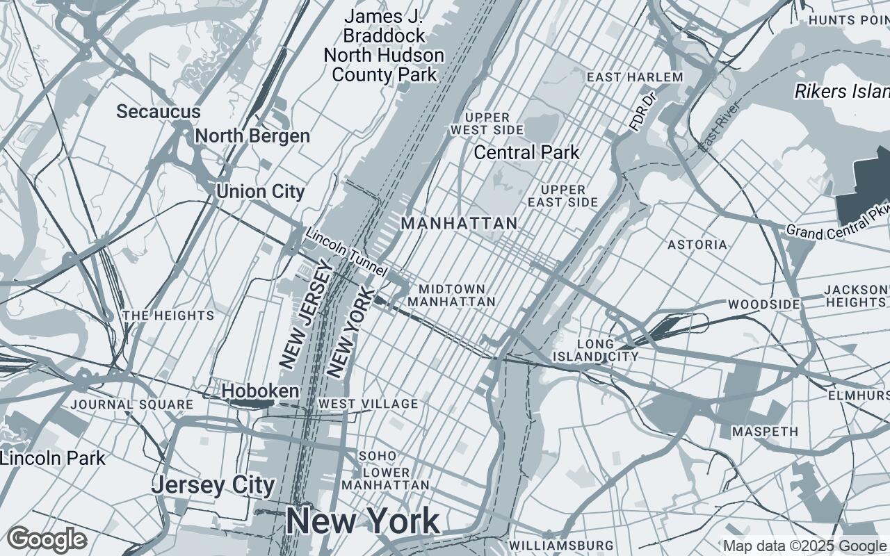
The Palette: A Foundation of Muted Tones and Professional Hues
At the heart of Aetherial Maps lies a carefully curated color palette, a symphony of cool, professional tones that evoke a sense of calm and sophistication. We've moved away from the vibrant, often distracting, primary colors of standard maps in favor of a more subdued and refined aesthetic.
Our palette is built upon a foundation of versatile neutrals, including a very light grey (#F5F5F5) and a slightly darker, cool-toned grey (#ECEFF1), providing a pristine canvas. Roads and primary features are rendered in a sophisticated light blue-grey (#B0BEC5), offering clear definition without harsh contrast. Secondary elements and less prominent features utilize an even lighter blue-grey (#CFD8DC), ensuring hierarchy. An accent blue-grey (#78909C) is strategically employed for key highlights or interactive elements, drawing the eye without shouting. Deeper blue-grey tones (#90A4AE, #455A64) are reserved for water bodies, dense urban fabric, or subtle shadow effects, adding depth and realism in a controlled manner.
This deliberate selection ensures that the map itself doesn't demand undue attention, instead serving as an elegant, supportive framework for your design concepts.
Styling Elements: Roads, Water, Buildings, and Green Spaces Reimagined
Every element within Aetherial Maps has been thoughtfully re-envisioned:
- Roads: Roads are depicted with a subtle, consistent line weight, using our primary blue-grey (
#B0BEC5). Major arteries are slightly bolder, but never overwhelming. The focus is on flow and connectivity, not on a jarring visual hierarchy. - Water Bodies: Oceans, lakes, and rivers are rendered in a serene, deeper blue-grey (
#90A4AE), providing a calming contrast without being overly saturated. Their subtle texture suggests depth and fluidity. - Buildings: Buildings are presented with clean, defined outlines and a soft, uniform fill, often leveraging the lighter neutral tones (
#ECEFF1,#F5F5F5). This minimalist approach allows for easy visualization of urban massing and block structures, providing a clean base for overlaying architectural models or site plans. - Green Spaces: Parks, forests, and other natural areas are depicted with a muted, earthy green, harmonious with the overall cool palette. The aim is to indicate presence and extent without introducing bright, distracting hues.
Labeling for Clarity: Prioritizing Information Hierarchy
Labels in Aetherial Maps are designed to be informative yet unobtrusive. We employ a refined typography that is highly legible, even at small sizes, and a strict information hierarchy. Primary labels (major cities, significant landmarks) are subtly more prominent, using a slightly darker grey (#455A64) for contrast, while secondary labels (neighborhoods, street names) recede gracefully into the background, visible when needed but not demanding attention. Points of interest are minimized by default, allowing the designer to focus on the underlying spatial data. This ensures that the map provides critical context without becoming a visual cacophony.
Beyond Navigation: Maps as a Design Tool
Aetherial Maps transcends the traditional role of a navigational aid. It transforms Google Maps into a powerful design tool, enabling architects and designers to:
- Conduct precise site analysis: Understand solar paths, prevailing winds, and pedestrian flows with a clearer background.
- Develop contextual designs: Integrate new structures seamlessly into existing urban or natural landscapes.
- Enhance client presentations: Present design concepts against a sophisticated, professional backdrop that reinforces the quality of their work.
- Facilitate urban planning studies: Visualize zoning, infrastructure, and demographic data with improved clarity.
Integrating Aetherial Maps into Your Workflow
Integrating Aetherial Maps into your existing workflow is designed to be straightforward. The style can be applied within Google Maps platform interfaces, allowing for a consistent visual experience across your digital tools. For static renders or print materials, the clean aesthetic ensures that exported images are presentation-ready, requiring minimal post-processing. Imagine dropping a site plan onto an Aetherial Map background, the two elements harmonizing perfectly, allowing your design to take center stage without visual competition.
Future Enhancements and Customization Potential
The journey of Aetherial Maps is just beginning. We envision future enhancements that will further empower design professionals, including advanced customization options to tailor the palette and feature visibility to specific project requirements. Imagine the ability to toggle specific layers, highlight certain urban typologies, or even integrate your own proprietary data layers, all while maintaining the elegant Aetherial aesthetic. Our goal is to evolve Aetherial Maps into an even more versatile and indispensable asset for the design community.
Aetherial Maps is more than just a new map style; it's a commitment to the precision, clarity, and aesthetic excellence that defines the world of architecture and design. Experience the difference a truly designer-centric map can make in your next project.