Aetheria Maps: The Cartographic Canvas for Visionary Design
Elevating Site Analysis and Spatial Understanding for Architects and Interior Designers
Aetheria Maps: The Cartographic Canvas for Visionary Design
Elevating Site Analysis and Spatial Understanding for Architects and Interior Designers
For too long, the maps that guide our daily lives have been a compromise for the design professional. While invaluable for navigation, standard mapping services often present a cacophony of visual information, obscuring the critical details that architects, interior designers, and urban planners need to truly understand a site. Generic aesthetics, cluttered points of interest, and an emphasis on transient data over enduring spatial context have left a void in the professional's toolkit. Until now.
Introducing Aetheria Maps: Architect's Edition, a revolutionary Google Maps visual style meticulously crafted to serve the discerning eye and rigorous demands of the design community. Aetheria transforms the traditional map into a sophisticated, information-rich canvas, designed not just to show you where to go, but to help you understand where you are, and what could be.
Beyond Navigation: Why Architects Demand More from Maps
An architect's relationship with a map extends far beyond finding the quickest route. It's about deep contextual understanding: the interplay of built form and open space, the flow of pedestrian and vehicular traffic, the subtle nuances of topography, and the character of a neighborhood. Standard maps, optimized for general public use, often fall short in these critical areas:
- Visual Clutter: Overlapping labels, irrelevant POIs, and vibrant, distracting color schemes detract from essential site features.
- Lack of Hierarchy: Key architectural elements like building footprints, property lines, and land use are often indistinguishable from less relevant data.
- Generic Aesthetics: The visual language rarely aligns with the refined sensibilities of design professionals, making integration into presentations challenging.
- Limited Contextual Depth: Information crucial for site analysis – such as building heights, material cues, or specific urban typologies – is either absent or poorly represented.
Architects and designers require a map that acts as an extension of their design process – a tool that clarifies, rather than complicates, their spatial explorations and project planning.
The Aetheria Philosophy: Clarity, Precision, and Aesthetic Harmony
Aetheria Maps is built upon a foundation of design principles that resonate deeply with the architectural ethos. Our persona is clear: to offer a visually refined and functionally precise mapping experience for professionals who demand clarity, contextual awareness, and aesthetic harmony. Every element, from line weight to color choice, is a deliberate decision aimed at enhancing readability and reducing visual noise.
Our core design principles include:
- Clarity over Clutter: Prioritizing essential information, minimizing visual noise to reveal the underlying structure of the urban fabric.
- Contextual Precision: Emphasizing structural and urban details relevant to design professionals, such as building footprints, property lines, and public spaces.
- Subtle Sophistication: Utilizing a refined color palette and restrained styling for a professional aesthetic that complements, rather than competes with, your design work.
- Hierarchical Readability: Ensuring clear visual hierarchy for quick information retrieval, guiding the eye to the most critical data points.
- Scalability and Detail: Maintaining aesthetic integrity and detail across various zoom levels, from broad urban planning to intricate site analysis.
- Design-Centric Focus: Tailoring visual elements to resonate with design principles, making the map an intuitive part of the creative process.
- Print-Ready Aesthetics: Optimizing for both seamless digital viewing and high-quality, professional print outputs.
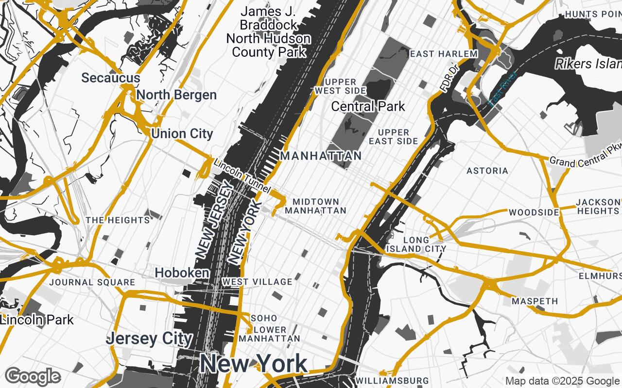
Unpacking the Palette: A Study in Understated Sophistication
The visual language of Aetheria Maps is defined by a carefully curated color palette, designed for maximum clarity and minimal distraction. We've moved away from the vibrant, often jarring hues of consumer maps, opting instead for a sophisticated, muted scheme that allows your project to take center stage.
- Neutrals: A spectrum of soft greys (
#F8F8F8,#E0E0E0,#C8C8C8,#999999) forms the backbone of the map, providing a calm, unobtrusive backdrop for land, water, and less critical features. These subtle variations create depth without visual overload. - Primary & Secondary: Dark grey (
#333333) and medium grey (#666666) are reserved for primary text, important building outlines, and key road networks, ensuring crisp readability and a strong visual hierarchy. - Accent: A single, elegant golden-brown accent (
#B8860B) is used sparingly to highlight critical points of interest, project boundaries, or specific features that demand immediate attention, providing a touch of warmth and emphasis without dominating the composition.
This palette ensures that the map remains a professional, understated tool, allowing the architect's vision to emerge with unparalleled clarity.
Key Features for Professionals: Building Definition, Land Use, and POI Prioritization
Aetheria Maps is engineered to provide the specific information architects and designers need, presented in a way that is immediately useful:
- Enhanced Building Definition: Buildings are rendered with clean, precise lines and subtle textural cues, clearly delineating footprints and massing. This clarity is crucial for understanding urban density, shadow studies, and contextual relationships.
- Intelligent Land Use Representation: Parks, commercial zones, residential areas, and public spaces are differentiated with distinct yet harmonious styling, providing an instant grasp of the site's functional context without overwhelming the eye.
- Prioritized Points of Interest (POIs): Irrelevant commercial clutter is minimized. Instead, Aetheria highlights POIs critical to design analysis – cultural institutions, transport hubs, significant public art, and civic landmarks – ensuring that the map focuses on the elements that truly inform design decisions.
- Refined Road Networks: Roads are presented with a clear, hierarchical structure, distinguishing major arteries from local streets and pedestrian pathways. This allows for intuitive analysis of circulation patterns and accessibility.
- Subtle Topographical Cues: Where available, elevation changes are indicated with understated contour lines or shading, providing essential information for site grading and landscape design.
From Digital to Print: Ensuring Versatility and Quality
In the world of architecture, a map often transitions from a digital screen to a printed page, a large-format plot, or even a physical model. Aetheria Maps is designed with this versatility in mind. Our